We started today’s lesson by looking into different artists that would relate to the workshop we were about to do on IMOOS (Images moving out of space), and here are a few that I found really interesting and that would perhaps link to my subject work; Bryan Wynter was an abstract painter and inspired other artists like Alexander Calder. Using a parabolic mirror, he would hang contrasting pairs of painted shapes, which rotated freely. Their reversed reflections enlarged, appearing to move in opposite directions.


“Imoos VI”, 1965 ‘Green Confluence’ 1974 We also looked into Charles Biderman’s ‘Work No. 3’, 1939, which was made of wood, metal and wire on a clear acrylic sheet, creating an optical clash. 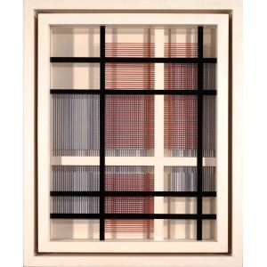 Another artist who caught my eye was Jesus Rafael Soto and his work ‘Cardinal’, 1965, who contrasted by only using black and white, which has just as an illusionistic effect on its viewer.
  I also researched into Frank Stella, and his piece ‘Hyena Stomp’, 1962. The title Hyena Stomp comes from a track by the American jazz musician Jelly Roll Morton. Stella was thinking about syncopation while working on the painting. He’s used contrasting colours that aren’t completely aligned, further contrasting using the lines and pattern. I’m interested in using this effect when we complete our box and use it for one of the colour slips inside.
  We then proceeded to look at each other’s work from our previous session, and found that we all created successful contrasting pieces of work, and I saw that there were very strong pieces of work from which colours they chose to use against each other and how powerful the use of colour is to a piece.
 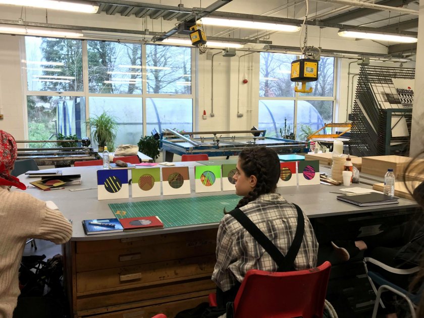 Before lunch, we watched Laura create a box and then made one ourselves. This certainly developed my concentration skills from the precise measuring, nailing and gluing. We attached four spaces inside the box for the slips that we’ll be making on Thursday and are planning on using them for the colour slips and shapes, as well as hang contrasting colours and patterns from above, using a clear plastic sheet to hang them from. We’re also going to paint the inside and outside of the box to further develop the illusion, by painting the inside a deep blue and the outside a watermelon red.


This is our current progression with our box;  (All images and information are from http://www.tate.org.uk/)

One thought on “Relational Colour – 23/01/18”