Side project on landscapes

Since looking into John Stezaker from the material project ‘Today, Tomorrow, Yesterday, September’, I’ve been generating ideas form making landscapes of where I live, which is Snowdonia. This has been very useful in making me work and be productive for my main project, as well as letting me experiment with different styles of painting.

7e9c87a72aa254b54c5e4184f56b7fad

An image by Stezaker of Betws-Y-Coed, near where I live. 

Dotty Attie

Dotty Attie’s definition of Feminism:

“My definition of feminism is actually very basic – it means no barriers between what a woman chooses to do, and what is acceptable, by societal and familial standards, for her to do. And it also means (to me) no expectations. Women should feel free to have enormous ambitions, or no ambitions, and not be penalized in any way for either.”

Since the 1970s, Dotty Attie’s multi-panel compositions have explored gender identity, politics, and culture through the re-imaging of well-known paintings and photography. She re-presents images from vintage photographs, movie stills, and contemporary photographs on square canvases meticulously painted in her signature palette of black, white, and grey with touches of flesh and rouge. Interspersed with panels of text, Attie’s works suggest an alternate reality to the constructed version we are so accustomed to through television and film.

I’ve been looking into her because I relate to her art very much and I appreciate her skill and style very much. I enjoy painting in detail and I’m inspired by her realism paintings because they behave almost as photographs of what she’s trying to convey. They touch on controversial subjects, such as consent and nudity, which are powerful by themselves. But she goes a step further by using her skill to capture an expression or emotion felt in the painting. I will definitely be thinking of this in my future paintings.

Where the development of my work is currently at.

dev.png

To begin with, I used overlaying editing to create a layered collage of my drawings of “selfies” that have received negative and/or vulgar comments (one being mine) and a drawing of a plant to go with my theme of using ‘pure’ imagery of natural things that are used as metaphors for women. These are to prepare for my large scale collage shaped paintings that’ll all correspond with this theme.

I’ve made actual drawings for my plans below;

I’ve been focusing on using a mixture of innocent and sexual imagery used by plants, for example, white flowers and red flowers, but without using any colour (at the moment) to develop the metaphor of women being seen as sexual objects but aren’t allowed to behave sexually, unless it’s only for the male gaze.

My next task will be to try a few of these collages out with board and progressively develop them into larger pieces. I will be adding colour to these pieces to strengthen the flower imagery and how people, especially women, are scrutinized for taking pictures of themselves, whatever they choose to show.

Again, I’m looking into what Piers Morgan has to say over what women can and can’t do with their bodies. He’s commented on how much women should show in photographs, such as very recently, when he said that Madonna’s image of a tattoo on her lower abdomen made him feel ill. (https://www.thesun.co.uk/tvandshowbiz/2604362/madonna-tweets-racy-picture-of-vagina-tattoo-but-piers-morgan-isnt-impressed-as-he-admits-i-just-threw-up/)


Today, Tomorrow, Yesterday, September: John Stezaker

For this material project, I looked into the artist John Stezaker who creates beautiful pieces by joining two images together; a romantic landscape and an image form a romantic film. From looking at his art, for 30 years or more Stezaker has been pondering visual incongruity, inverting, rotating, slicing and splicing pairs of old images to create new works of art. His juxtapositions are anything but seamless – colour/black and white, male/female, portrait/landscape – precisely so that the eye is confronted by obvious disunities that the mind must somehow resolve.

Sometimes the idea is so simple one marvels, above all, at the strange effects. Stezaker removes the top half of a starlet in jodhpurs and her braced legs appear inexplicably monumental. He crops Big Ben so that the clockface is tiny against the glorious frame-filling sunset above, time mocked by mere elements. He nips and tucks: one film star is blinded by the excision of a narrow strip across the eyes; another becomes bug-eyed by the doubling of this strip, which also gives the collage an optical shudder.

I decided to look into him for inspiration because he contradicts beautiful, natural landscapes with images from what can be seen as other-wordly, which is comparable to me moving to Cardiff from North Wales where I was always surrounded by mountains and nature. His work also, in my opinion, works well with this event because one of the images he took was from Betws-Y-Coed, which is about twenty minutes away from where I live. I tried doing this with my own work by comparing Cardiff to my village; looking at the similarities as well as my new experiences.

John Coplans, ‘Hands Holding Feet’, 1985

d6c1c22147141bc2580f8099cf5f1201

This is a black and white photograph of the artist’s feet over which he has placed his hands. The photograph was taken at the level of the ankles, viewing them directly from the front. Coplans’s fingers are clutched over his ankles, his fingers touching the beginning  of each foot. The skin at the joint of his knuckles appears stretched. The image is tightly cropped, ending at the artist’s wrists at the upper edge. A narrow margin of white background on either side of the feet frames the body. Thick black hair covering the artist’s feet and hands curls off his skin and contrasts sharply with the white ground. Massively enlarged, the depicted body parts become like a landscape of skin texture and body contours. The silver gelatin print has the sharp qualities of an etching, emphasising surface detail. Strong studio lighting has created dark shadows behind the wrists and in the space between the knees below the fingers, conferring a dramatic atmosphere.

When we first saw this image in our lecture, we were all intrigued and disgusted at the same time. These are not attractive feet, rather worked feet; ones that have been walked on and used to the point of roughness. This is what makes it interesting. The image is something beautiful, but not in the conventional form, but rather in a wise and respected sense. However, it takes longer to realise this, as I and other students gathered after we discussed the piece further. I wanted to add this photography piece to my blog because I want to look into the unconventional side of beauty, images that fight against harsh societal standards and leave lasting impressions on people as the image did to me.

Material Projects and what I learnt from them.

I participated in the material projects Today, Tomorrow, Yesterday, September, Concertopia and Shaped Paintings. They all offered very different skills and ideas, all of which I’ve used since in one way or another.

My first material project was Today, Tomorrow, Yesterday, September and I learned about print making and the different sort of printmaking I could make, and quickly, which will be tremendously useful for planning and sketchbook work I’ll be doing in the future. I also learned about monoprints, however I didn’t get a chance to try it out but I’ll certainly include them in my work for Inside/Outisde because the effect is very aesthetically pleasing as well as it having a powerful potential. I also found out about the artist John Stezaker who uses landscapes as well as photography in his work, which are beautiful and powerful by usually being two romantic, but totally different, images emerged together; a process so simple yet very inspiring.

14600784_1236831673030012_1147117101_o

For Concertopia, the most useful tool I gained from it was using psychogeography, which is an approach to geography that emphasises playfulness and “drifting” around urban environments to find interesting objects, which could potentially be very useful for my work. I’m definitely looking into using photography because I finally got to use photoshop and it turned out well. I’ve also been looking into artists who use photography, such as John Coplans who uses many black and white photography of himself, and I’m very interested in the effect they can have, especially when using photoshop to amplify the effect.

thumbnail_concrete-photoshop2

The one I enjoyed most was Shaped Paintings because it attracts me to make something from scratch in the way you make a shaped painting. It’s never a blank canvas because it’s already a piece once you’ve cut out the shape(s) and it could still turn out completely different to your first idea. They can also be incredibly powerful to use for art pieces because they make such strong statements from being a shape, rather than a rectangle shape, which is very useful for my political pieces and a useful thing for me to have learnt from this project. This project also lead me to many feminist artists that I’m still currently, such as Dotty Attie and Ilona Granet, who use materials from text to detailed paintings, giving me a huge variety of ideas to play with for my Inside/Outside project.

14740961_1258793647500481_479660147_n

My most developed piece

I wanted to include a shaped painting I believe is the most developed as well as one of my most recent sketches because it’s what I’m planning on doing next, which is a development in itself.

The first one is a front side of a woman, the back of her and the female reproductive system covered in thorns. The front of the woman has an opening full of roses to represent the woman as something natural as well as the stereotypes/standards such as “an English rose” that signifies beauty, fragility and purity. The reproductive system links to this because I added thorns to the tubes, showing strength and perhaps dangerous side to women, which hasn’t been seen in the media until very recently. The woman’s back represents someone revealing themselves, for example, in photographs, thus showing their sexuality and being allowed to.

The shaped painting is half a self portrait, half a portrait of all women. I mean this in the way that it looks like me, but represents my freedom and the freedom that all women should have. I tried showing this by using sunglasses because it’s an obvious “easy going” look, as well as having a darker side or meaning, which is exactly how I see women’s rights at this point in time. I wanted to display how many women in Western countries are much freer than other women in perhaps poorer countries, showing how there is still a lot of work to do before women are treated totally equal. However, this does not mean that Western countries offer women freedom within some subjects, such as abortion, as they don’t allow women to receive education in Pakistan which made headlines recently when the Taliban shot 15-year-old Malala Yousafzai in the head for pursuing her right to learn.

Inside/Outside: Shaped Paintings and Feminism


14740961_1258793647500481_479660147_n

The above image was my first shaped painting, based on feminism and the bigotry we still face today. It was also made just before the election was held in America, when a lot of offensive things were said about gender, race, sexuality and ableism. Ever since making this piece, I’ve been making many different shaped paintings based on feminism and racial issues, especially.

15133725_1273712919341887_138772457_o

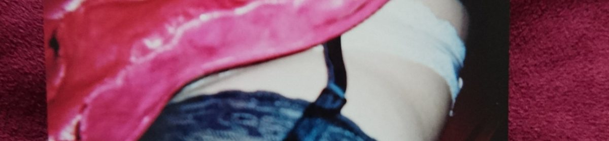
I enjoy adding text to the images, especially in bold colours and large text for extra effect on the issue I’m addressing. I wrote, “My body isn’t obscene”, for this piece because I’ve always been confused and often angry over regulations on social media, especially Facebook, where we’re allowed to say Nazi slurs but not show our breasts. As a social experiment by a German photographer, Olli Waldhauer, shows just this, as he places a woman without any clothing on the top half of her torso next to a man holding up racist signs, and it was put down because of nudity. (http://www.theverge.com/2015/11/3/9662836/facebook-hate-speech-germany-protest-topless-photo-racism). I’ve also noticed how many ‘young’ breasts or breasts that aren’t obviously female at first glance can slip through the female breats ban, such as in advertisements. An artist called Ella Dreyfus has challenged this by using her artwork on Aboriginal women, who show their breasts that later on had to be censored, lead the internationally acclaimed artist and senior lecturer at the National Art School to believe that Facebook deems some female breasts more acceptable than others. (http://www.smh.com.au/technology/web-culture/how-facebook-decides-which-female-breasts-you-can-see-20160315-gnjdub.html)

shaped

I made this piece because I often hear my male flatmates speak of black women as an unusual fetish. They often say things like, “I’d love to go with a black bird, they can be so hot”, without even realising how disrespectful to women they’re being, as well as racist. However, it’s sadly said very often by many people. Many races that aren’t white are seen as amusing, such as Native Americans and Halloween costumes based on them that include sacred crowns and headdresses. These are worn without realising the offence it creates. The piece is meant to address this issue because it’s an issue that many refuse to accept or believe is there.

I used red crossed over the nipples to, again, symbolise the censorship women face as well as how people see black women and women of other races as purely sexual objects especially more than white women. I also only used the top half of the torso and didn’t give her any legs, arms or a head to show vulnerability, being immobile objects and without identity, something women of different ethnicity have to challenge daily.

I wanted to make pieces that value the strength and happiness different women hold. I made both of these; one has an identity because I gave her a facial profile and one has her back turned, but I gave her a strong and harsh beginning of a backbone. The first one is symbolic because I wanted to go back to using eye imagery, like I did with my very first one, which reflects on society and how narrowly we look at people. However, this is supposed to be the opposite by adding many different eyes to her face to symbolise acceptance and an open mind. The one on the right is meant to be a powerful figure without ever seeing her face; we don’t know if she’s attractive or not, all we know it that she has strength in her back and a bold haircolour.

15879324_1327715103941668_608118277_n

This piece subtly shows a feminine figure to let the main focus be the text. I also used red acrylic paint to do this to show passion for the subject of how women are objectified to the point of believing that their main purpose is to please and serve a man. However, I wanted the gender to be ambiguous by using stereotypes and social constructs; I painted the figure in blue, which is usually seen as a masculine colour, pointing out how males are also now seeing this effect since the rise in male modelling, as well as for transgender people.

15910249_1327715237274988_1493420831_n

I used the quote, “she’s all legs”, as my inspiration for this piece. I also gave her small feet because it’s desirable in many countries for women to have incredibly small feet. This is meant to be a flirtatious piece that almost reclaims the expectation for women to be desirable because they aren’t shy, overpowered legs; I made them “happy legs”. I’m currently looking into what’s empowering to me and other women, and I definitely thought that this would fit in well.

15879307_1327715187274993_1169321393_n

Again, I wanted to look into gender ambiguity. I wanted the portrait to have masculine and feminine features, as well as having both pink and blue on it. I was also trying to touch on all aspects of the LGBT+ community, such as transgender people.

15909790_1327715210608324_30477116_n

This is a painting of Marilyn Monroe from a famous photograph, but only her body, in order to highlight all that everyone thought was important about her; not her talents, troubles or any other characteristics she had, just like what many women face. She’s probably one of the most famous objectified and over-sexualised women to have existed, thus an excellent example for my work.

15878648_1327715050608340_408232984_n

This shaped painting is half a self portrait, half a portrait of all women. I mean this in the way that it looks like me, but represents my freedom and the freedom that all women should have. I tried showing this by using sunglasses because it’s an obvious “easy going” look, as well as having a darker side or meaning, which is exactly how I see women’s rights at this point in time. I wanted to display how many women in Western countries are much freer than other women in perhaps poorer countries, showing how there is still a lot of work to do before women are treated totally equal. However, this does not mean that Western countries offer women freedom within some subjects, such as abortion, as they don’t allow women to receive education in Pakistan which made headlines recently when the Taliban shot 15-year-old Malala Yousafzai in the head for pursuing her right to learn.

15910094_1327715163941662_260358925_n

I made this to further develop my theme of women’s bodies being completely natural and not at all obscene, which is what many people think once a woman chooses to show more than is seen acceptable. I’m also going to look into comparing women to snakes and what it has meant when artists, poets, writers and play writers when they choose this metaphor to describe women.

15879035_1327715043941674_472926936_nThis idea came to me when I saw in a comment section on facebook that had a woman being attacked for calling herself a feminist while wearing a hijab in her profile picture. She should have the right and freedom to wear whatever she wants to which is exactly what feminism is. I kept with the theme of using pink and blue together to create a sort of unity between all genders, as well as harsh language to add urgency to the theme.

16700102_1362684637111381_1783189142_n

I used a lot of red under-layer paint for the first piece, green for the middle piece and blue and green for the last, in quick strokes with a lot of texture by using thick paint. I decided to use red for the female reproductive system piece because I wanted it to come through the black, as if it’s seeping blood and act as a metaphor for inequality, such as the tampon tax, for example, as well as the argument of how women are too ‘hormonal’ to be responsible/in power. I also added thorns to the piece to symbolise women being fierce but their bodies and anatomy is still beautiful, like a rose. I’ve been wanting to use flower/nature imagery for a while, therefore I’m very happy with this piece.

The female figures have green paint showing through the ‘skin’, which is also meant to symbolise how women’s bodies are totally natural and not at all obscene. I decided to make two women; one showing the front, standing upright with her arms positioned in almost a hard-working, powerful way on her hips and a woman’s back, but slightly bending with a bit of weight on her. The two bodies are meant to symbolise the link between all women and how all are very capable of being strong and fierce. I wanted to add more nature into the piece for it to all tie together well, therefore I opened up the front-facing woman’s stomach and revealed flowers where her reproductive system would be, to once again show that her body is natural and fierce.

I wanted to create a lot of texture for this one, and it ended up being one of the largest shaped paintings I had done. I created abstract faces of women, one was bald and full of warm, bold colours while the other had cool colours, creating a contrast within the piece. I also included long grass/leaf type things coming out, adding a natural element to the work, once again. The textured bit is heavy and chaotic, reflecting the unfairness of the fashion industry towards women.

This is the final shaped painting I created, which also became the largest one I’ve created, showing the confidence I now have to create larger and more ambitious pieces. I included body parts of different women from different races, looking into fetishised body parts, such as black women in porn, young school girl clothing and bare shoulders, which is seen as provocative. I then added roses where the head should be and around the same area as the female reproductive system to carry on with the theme of the naturalness of a woman.

Life Drawing: Looking at Tracey Emin

We looked at several different artists during our life drawing session, but the one who caught my eye was Tracey Emin. Her simple drawings catch the movements of the people so delicately, but by using harsh and almost rushed looking lines. Many of her drawings reflect her insecurities, her sex life and often empower her. She told the guardian, “This is one of my favourite drawings – it’s one of the Margate series. The text on it reads: “harder and better than all you fucking bastards”. What I find interesting about it is the memory of myself as a girl, yet I have drawn the body of a fully grown woman. Sometimes as a teenager, after I had sex, I felt very unloved and used. Often the men I slept with would taunt me, sometimes about my body. This is what provoked me into making this drawing.” tracey-emins-harder-1995-001

These are exactly the sort of topics I’m interested in as they link into feminism tremendously well. Her other art works that I looked into during the life drawing session were these;

I very much enjoyed working freely without any sort of preparation or planning, something I’m very guilty of doing when I draw people. To get started with, we experimented by only drawing the space around the model, not her. This left a white figure in the dark space around her which left an interesting effect to the drawing, very much like Tracey Emin’s simple black and white drawings. We then went on to only using one colour to paint the model, which is also difficult if you usually draw and paint with detail, as I do. However, I enjoyed the process because it was a lot quicker and freer process, and the end result was also an interesting contemporary and abstract finish. The cut-outs were also fun, and I also pushed myself further by only letting myself cut through the paper once to get the shape (except for the holes to show the gaps between the arm and stomach), which gave me a different looking figure because of the proportions. I was pleased with it because it gave me ideas of body proportions/symmetry for my Inside/Outside project, as well as it linking with Tracey Emin’s work with body positivity.


Maes

Rwyf wedi ymuno â’r elfen Gymraeg o’r cwrs ac ar hyn o bryd yn gweithio ar wahanol brosiectau e.e.. creu, allan o wifren, adeilad sy’n bodoli yng Nghaerdydd, a fydd wedyn yn cael ei gyflwyno ar gyfer cystadleuaeth ac yn cyfrannu at maes.

Hyd yn hyn, rwyf wedi dechrau ar y gwersi a fydd yn ehangu fy nealltwriaeth o sut i gael gwifrau i doddi gan ddefnyddio gwres a ddaw o drydan ac wedi creu darnau fel sydd yn llun isod (sydd ddim yr esiampl gorau, ond roedd yn ymarfer wych!).

Rwyf wedi dechrau gweithio ar fy adeilad gwifren, sef John Lewis, gan fy mod yn meddwl fod yr adeilad yn un diddorol iawn i edrych arno ac wedi ei adeiladu gan ddefnyddio dull haniaethol i edrych bron fel blaen llong. Dyma’r math o luniau y byddaf yn ceisio seilio fy ngwaith arnynt.

Dyma yw fy nghynnydd hyd yn hyn;

Er credaf fod y canlyniad terfynol yn eithaf llwyddiannus, nid wyf yn hollol hapus gyda’r ffordd y gwnaeth y darn o waith droi allan. Roedd yn anodd i blygu’r wifren oherwydd ei fod yn drwchus, ac arweiniodd hyn at ychydig o nodweddion i edrych yn rhyfedd. Roedd hefyd yn anodd i wneud ‘spotweld’ os nad oedd y wiren mewn man penodol. Canlyniad hyn oedd bod ‘spotwelding’ yr adeilad yn arbennig o anodd. Fodd bynnag, mae’r darn yn debyg i fy nghynllun gwreiddiol ac yn sefyll i fyny sydd, ar y cyfan, yn fy ngwneud yn falch o’r canlyniad terfynol.

Ar gyfer fy ail brosiect byr, rydym fel grwp ac yn unigol yn creu cyfres o oleuadau crog. gwneir rhain o boteli gwydr sydd wedi ei thorri yn hanner ac yn cynnwys gwead ar eu harwyneb sydd wedi ei seilio ar gynllun. Prif amcanion y gwaith yma yw datblygu sgiliau cyd-weithio a datrys problemau. Erbyn hyn, rydwi i wedi creu pum fraslyn sydd wedi eu hysbrydoli gan thema ‘Dyfodol Nawr’. Bydda i a fy ngrwp i’n cydweithio i werthuso’r syniad a phenderfynu ar ba tri ddyla ni fireinio’n bellach ar gyfer cynhyrchu. Fy syniadau i yw edrych ar rhagfyniediadau pobl o sut bydd ein dyfodol ni’n edrych mewn 50+ blwyddyn, felly edrychais ar tyrbin gwynt, pobl yn byw yn hyn, adeiladau eithriadol o dal, adeiladau efo gerddi a phlanhigion ar eu toeau ac anifeiliaid gwyllt yr ydym efo nawr mewn amgueddfeydd oherwydd eu bod nhw’n ddiflanedig.

Mae’r themau wedi newid i fudiad celf a phensaernïol sef Lluniadaeth a ddechreuodd yn Rwsia yn 1919. Prif y nod Lluniadaeth oedd ffafrio’r defnydd o Gelf tuag at bwrpasau cymdeithasol â wnaeth barhau tan 1934.

Dyma enghreifftiau dwi am ddefnyddio i ysbrydoli fy nghynlluniau;

A dyma yw’r dyluniadau rydw i wedi gwneud erbyn hyn;

Cychwynnais wneud deg braslun drwy edrych ar y lluniau y gwelais mewn llyfr. Dwi’n ceisio edrych yn fanwl ar y siapiau geometrig, fel trionglau a sgwariau, a llinellau hir efo bylchau er mwyn creu dyfnder/edrychiad 3D yn y lluniau. Dwi hefyd yn trio cadw’r brasluniau mor syml ac sy’n bosibl oherwydd mae’n creu edrychiad modern iawn i’r adeiladau. Byddaf hefyd yn defnyddio sgwariau a thrionglau i greu edrychiad llonydd a cadarn iawn i’r adeiladau gan fod y lluniau o’r llyfr yn dangos llawer iawn o adeiladau o gyflwr solet iawn.

Dwi wedi gwneud pum braslun sydd yn fwy gorffenedig erbyn hyn. Dwi’n teimlo eu bod nhw i gyd yn ddigon syml a modern i alluogi i mi eu torri allan er mwyn eu defnyddio ar fy mhoteli ond efallai dydi’r rhai crwn a’r rhai triongl ddim am ffitio yn dda iawn ar y poteli, felly ni fyddai’n gallu defnyddio’r cynlluniau yna (sydd isod).

Dewisais y tri dyluniad yma i wneud ar fy nhair potel gan eu bod nhw’n ddigon hawdd torri allan a hefyd nhw sydd yn mynd efo’r themâu orau

Efo’r dyluniau yma, torrais allan y siapiau ar ddarn o vinyl er mwyn gallu rhoi ar y boteli er mwyn gallu rhoi nhw i fewn ‘sandblast’;

Treuliodd ni bore, fel grwp, hel syniadau tuag at ein prosiect newydd. Mae ein syniadau i gyd o amgylch y brifysgol a sut ydym yn teimlo yma. Yn bersonol, fe wnes i ddangos sut oni’n teimlo her ac yn poeni dros pethau fel pres yn aml, a dyma be wnaethom ni ddod allan efo;

Dyma’r boteli gorffenedig;

Dwi’n eithaf hapus gyda sut wnaeth y poteli droi allan, er fod y sandblast heb weithio yn grêt i mi. Mae’r golau tu mewn i’r poteli yn dangos y siapiau yn dda ac yn creu edrychiad diddorol iawn i’r poteli drwy creu symudiad a chysgodion llawn siapiau gwahanol o’r thema celf phensaernîol . Mae symud y golau o amgylch y poteli hefyd yn creu edrychiad gwahanol, sydd yn diddorol iawn edrych ar, gan drio dal beth sy’n digwydd efo camera, gan fod y siapiau o’r sandblast yn symud gyda’r cysgodion. Ar y llaw arall, byddai’n sicr o wneud yn siwr fod y sandblast yn gweithio yn iawn cyn ei ddefnyddio tro nesa, gan fod dyna sydd yn gadael y darn i lawr, yn fy marn i. Ond mi wnesi mwynhau y prosiect yn fawr iawn ac yn sicr o ddefnyddio y prosesau eto yn y dyfodol.