My Final Piece

I began building my box/cubicle recently, with help from Imogen Spurrell, which has been rather challenging. I measured and cut very large pieces of MDF wood to begin with, then glued frames for the screws and screwed them together. In a rush, I glued and screwed the wrong sides, having not noticed until after I had finished. However, this was easily fixed and it is now standing upright, ready to be painted.

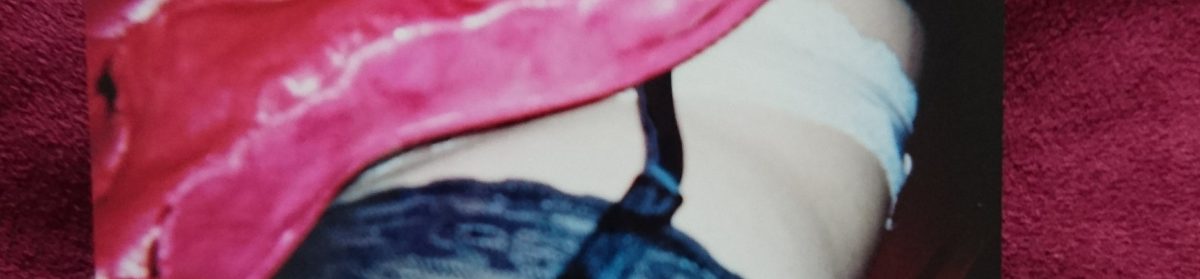
I positioned the window hole (cut out with a jig-saw) so that the audience can only see the bottom of my face and my breasts, which will all be part of my performance as a sex object. I’m planning on ‘offering’ to show my large clay vagina for fake money that I’ll supply for the audience to participate in my performance.

dsc_00281268689701.jpg

Performance plan

  • Dress up as a sex worker using online images of the Amsterdam Red Light District for reference
  • Go live on my new instagram page and document the responses
  • Print fake money for people to “pay” for what I perform – excessive amount for something like a smile and a small amount for me to perhaps hold up my clay vagina, etc. (the amount of fake money for gestures won’t make sense or match up to reflect the difference in sex workers’ pay in Amsterdam in contrast with Liverpool)
  • Take pictures of the performance before assessment to show and make it a live performance for the final exhibition
  • Maybe make is interactive in another way? Get friends to bang on the box while I’m inside to reflect the sex workers’ treatement

I began painting my box today, using a liquor black paint for the outside and crimson red for the inside to reflect the Red Light District. I found that the black wasn’t too intensely black, which went a lot better than a true black would against this crimson red, which worked well to reflect the night time atmosphere I wanted. The red is also a very deep and seductive colour, and the significance of red rooms is important for this piece. Red rooms online are dark, torture rooms, red from blood. In Jane Eyre, the colour red in her red room signifies the start of her menstruation, passion, anger, and violence. In recent literature, they’re used as sex rooms, using the colour’s connotations of passion. I will be using the connotations of anger and violence as a contrast, suing the red interiors as the safe place I’ll be stood where the audience can’t get to me, yet is clearly confrontational against the unfairness of sex workers rights in the UK.


I put up the neon lights, spelling out “sexwork is work” after thinking about the most powerful words I could put in contrast with the attractive lights. I believe it will certainly gain attention from the audience, shining a light on their importance. I also positioned the lights to be in the center of the window, making it all you see when I’m not inside.


I decided in the end to use the money idea to convey the absurdity of unfair sex work pay in Europe, using Amsterdam and Liverpool as references.


I also finished the box off by inserting the window, the door curtain and fabric for the roof, completing the box as a dark, enclosed space for my performance and lights.

Before the exhibition performance, I was able to take pictures of what I’ll be doing with a phone camera and a disposable camera, similar to what a tourist would do.


Documenting responses to my performance


Doing this performance at university in comparison to online on social media was more different than I expected. For one, I felt safer and less embarrassed at university than I did going ‘live’ and posting pictures on instagram. I found that people were shy about seeing me at university, which I expected, while a few found it easier to engage with me online, which is seen below. I think it will be interesting to compare more images I put online to my exhibition performance, as I’ll have an even larger audience to show and observe their reactions. I’m very interested in how online, my audience can feel free to be forward about my poses, but I’ve never experienced anything like that in person with anyone, which perhaps might change at the large exhibition. I also had my photos taken of my performance using a disposable camera, as a tourist might visiting the red light district, and I plan on showing these at the exhibition as well as online to compare responses to these, too.


At the exhibition, with total strangers as my audience, I received a very different response to my performance. People seemed to really enjoy it and participated in it freely, asking for prices and giving me the fake money in exchange for a part of the performance. While I really enjoyed doing my first performance piece, I also think I could have developed my idea even further in a completely different way. However, I found that doing this piece was essential for my development as an artist and is helping me realise errors and gaps in my work that I will hopefully fill in my third year.

screenshot_20180614-223000214281707.png

My ideas and pieces leading up to my final piece

My chosen artwork is by Huguette Caland, named ‘Self Portait’, 1971, which is a piece from a series of drawings I saw in the Venice Biennale, which were extraordinarily delicate, intimate ink drawings of female genitalia. I decided to go down the route of using theories discussed in Cath’s Goddesses and Monsters about phallic women and castration fear, which has created an element of humour in my work.

haguettec

I started by drawing her piece and created collage-type drawings of it, which lead to different drawings of vaginas in Caland’s simplistic style.

Firstly, I was having difficulty on how to actually develop such an open piece; I could have stuck with its simplicity and have my work open to interpretation by using delicate drawings, or I could incorporate all that I’ve learnt through lectures this term and create interesting, but rather abstract, set of pieces that could still be open to interpretation.

I wanted to create these pieces without taking the meaning behind them too literal, and have them mean something different to every spectator, which would in turn make my pieces even more interesting to look at and discuss.

I used the original artwork of the vagina and used a theory from Constellation about phallic women and castration fear to develop it, which helped me create this idea. I also used materials to make it symbolic, so that it wasn’t too literal.

23316161_1636061223107053_770214102_n

I’m very happy with how they’ve all turned out, and I’m pleased that I went down the more abstract route. Creating a sense of wanting to touch the pieces and analysing why I made them in this specific way is exactly what I wanted.

The materials I’ve used, I believe, are very important to the pieces I’ve made. I chose to use a combination of fabrics, such as velvet, silk and lace, alongside clay, paint and wood. These contrasting materials heavily link to Goddesses and Monsters, as well as Caland’s Self Portrait. They link by using Ovid’s myth of Pygmalion and constructions of the feminine ideal. Themes of gender construction and embodiment identified in the poem and investigates themes of sculptural transformation, corporeality and the desire for idealised somatic forms. The myth offers insights therefore into key tropes relating to gender configuration and discourses of materiality when creating/fashioning representations in visual culture. By dressing up my vaginas with fabrics that conceal and reveal at the same time, especially soft fabrics that are very inviting to the viewer, I create a contrasting piece. The contrast is in how vaginas are seen so much in porn but not in everyday life, thus is hidden and is distracted by other comforting parts of the body, such as legs and breasts. I chose to make vaginas in all shapes and forms and used fabrics to create a sense of irony and humour to how we dress our bodies up to distract the male gaze from how ‘horrifying’ vaginas are. I’m also looking into how I might incorporate vagina plastic surgery, such as cutting off the labia in order to create a ‘tidy’ vagina.

The wood and the clay offers insight to how vaginas really are; the clay creates folds and an almost realistic texture to the vagina, while the wood supports it all, signifying it’s strength.

23423387_1636061266440382_544933630_o

From my previous assessments, I planned to incorporate my vagina pieces into photography by using them as props and consider other social issues, such as the red light district, which stereotypically include heavy fetishism imagery. These ideas were brought on by the Ways of Exhibiting part of the course, which lead to creating work that fitted into my subject work perfectly because of this.

I also created numerous different sizes of clay, abstract vaginas – especially smaller ones, and I hope to include issues such as the ‘designer vagina’ that means to “tidy” vaginas by trimming the labia. I want to make them look floral from certain angles, which would aesthetically deem them beautiful, such as what I’ve done below;

img_20180217_231918_824292849745.jpg

I began by making miniature clay pieces of vaginas from drawings I made in my sketchbook. I made 23 in total and they’re all in various shapes and sizes and have an organic look to them to fit in with the illusion idea I have to take pictures from different angles and have them look floral. Here are how they look before being painted;

And below are after being painted. I then began experimenting with different camera angles to get the best effect for my idea. Some came out terribly while others really worked!

I stuck with using a bright pink/red colour for the vaginas to resemble bright red flowers, and I’m really happy with how they turned out. It was difficult to get my phone camera to focus on the pieces very closely, therefore I wasn’t able to take zoomed in pictures and create an even better illusion to get people to question what they are, but I do feel that they look organic enough for this effect anyhow.

I was also able to finished shaped/relief paintings I began a while ago, which were, once more, based off of drawings in my sketchbook. I first off used clay to add depth to the shapes I’d cut out, then painted and used fabric on one to correspond with my previous work about fetishism with, for example, hair, clothes, bows, etc. They tie-in my previous shaped paintings with my clay sculptures well by being a transition between the two and they also helped me with my dissertation research by letting me look further into these topics.

Technical skills I have learnt and developed from Relational Colour

We successfully completed a ‘Bryan Wynter’ box and over twenty different slides together, as well as a variety of different hanging pieces. I was initially unsure about working very precisely and having to measure and plan things out because I’m never inclined to do so with my own work. However, I found that I did enjoy the process and that the finishing outcome of what we made looked very professional.

This project also unexpectedly made me realise what I really enjoyed about working with colour and shapes, which was the optical illusion aspect of it. I further researched into artists who made work around this, such as Oleg Shupliak, whom I’ve never come across before, although could really help me in my subject work, as I like working around metaphors and political issues. Using illusions could definitely help me convey my ideas interestingly, and help it be not quite as obvious as I had previously been working. I printed on fabric and made prints to convey all of these ideas in a workshop, and I decided to make as much work possible to be able to have a huge variety of pieces to use for the slides in the box.

I will definitely carry on with working with colour and bring many ideas that I’ve gathered from this project to my own work. The use of colour was never important to me before this project, therefore being able to use it primarily to create the overall effect has really opened my eyes to using it carefully. This will further add to using a more abstract approach to my future work, such as the optical illusion aspect that I really enjoyed.

The most important thing I’ve taken from this project is to not be afraid to build things and be practically creative. Making this box partly inspired my final piece by pushing me to build a large cubicle-type MDF box for my red light district inspired performance. Making the box for this project made it a lot easier to plan and build, and knowing what I knew after let me plan it from scratch, thus giving me the freedom and opportunity to do exactly what I wanted for the exhibition.


Radio Cardiff

Imogen Spurrell and I were given the opportunity to speak on Radio Cardiff about our Site Venue projects and our final pieces for level five. I found this to be fantastic after hearing from other students asking about our future collaborative work, as it almost worked as advertisement. I spoke about my ideas revolving around feminism, sex work and objectification, and how I use myself as the object in my work, and it got me questioning myself about why I did this, and speaking about it publicly helped me see why. I was also able to advertise upcoming exhibitions I was involved in, including our final exhibition and a collaborative one with other students on my course in perhaps Made in Roath and Kongs. I don’t doubt that this will lead local listeners to take more interest in art student’s work, what Made in Roath do, and come to support future exhibitions.

Below is a link to listen to us on the radio;

Site Venue exhibitions

I really enjoyed this part of subject because it turned out to be incredibly important for the development of my work by inspiring my final piece for subject in June. The first project was the diorama and creating something from a cardboard box. I chose to only exhibit the first box I made because it went with the theme of my locker exhibition and my subject practice. For my box, my idea was to create a room in the red light district, since I visited last winter and have quite a few opinions on them. I really like the idea that the sex workers are genuinely cared for and have laws to protect them, and I also like how they make money from ‘playing’ the objectifying game, that’s usually against women, to make a living.

Imo and I created the poster for this exhibition, luring our audience with some humour from the Blue Peter examples we were shown in our lectures.

received_1841750402522353935443115.jpeg

For the locker exhibition, I created something a little different to the box by making the walls look like the inside of a vagina using painted cling film. I used closed curtains as the opening of the locker, forcing the audience who wished to look inside to open them up themselves, perhaps making them feel like they’re intruding or being invasive. I also created a soundtrack for the locker which includes dramatic porn noises, me reading out fifty facts about the vagina, and the sound from a documentary of sex work in Liverpool.

Here’s the poster created for this exhibition, which was a huge success because the turnout was great.

received_16434499823596381632868676.jpeg
My favourite part of site venue to take part in was going around every other group’s projects, including Sashi’s ‘The Uncomfortable Zone’, where she’d made a series of uncomfortable works, including food and shame hats that had people sat in a circle, sharing stories of shame.

I also really enjoyed this interactive piece by Toqa, made of post-it notes, enabling people to write or draw whatever they wished to.

screenshot_20180430-175437464362814.png

Huguette Caland’s 1971 “Self Portrait” and my continued ideas and material responses to it

My chosen artwork is by Huguette Caland, named ‘Self Portait’, 1971, which is a piece from a series of drawings I saw in the Venice Biennale, which were extraordinarily delicate, intimate ink drawings of female genitalia. I decided to go down the route of using theories discussed in Cath’s Goddesses and Monsters about phallic women and castration fear, which has created an element of humour and irony in my work.

haguettec

I started by drawing her piece and created collage-type drawings of it, which lead to different drawings of vaginas in Caland’s simplistic style.

I wanted to focus on the materials I used to create these sculptural/paintings of vaginas in order to create a meaning, leaving them open to interpretation. My idea was to use contrasting materials of soft fabrics, making the spectator want to touch them, as well as use clay which mimics what a vagina actually looks like. The act of dressing up a vagina then opens up a social issue that women face, as well as a slightly humorous side of fetishism and strip tease – but by using a ‘scary’ vagina, rather than an entire body.

From my previous assessment, I planned to incorporate my vagina pieces into photography by using them as props and consider other social issues, such as the red light district, which stereotypically include heavy fetishism imagery. These ideas were brought on by the Ways of Exhibiting part of the course, which lead to creating work that fitted into my subject work perfectly because of this.

I also plan on creating numerous different sizes of clay, abstract vaginas – especially smaller ones, and I hope to include issues such as the ‘designer vagina’ that means to “tidy” vaginas by trimming the labia. I want to make them look floral from certain angles, which would aesthetically deem them beautiful, such as what I’ve done below;

img_20180217_231918_824292849745.jpg

I began by making miniature clay pieces of vaginas from drawings I made in my sketchbook. I made 23 in total and they’re all in various shapes and sizes and have an organic look to them to fit in with the illusion idea I have to take pictures from different angles and have them look floral. Here are how they look before being painted;


And below are after being painted. I then began experimenting with different camera angles to get the best effect for my idea. Some came out terribly while others really worked!

I stuck with using a bright pink/red colour for the vaginas to resemble bright red flowers, and I’m really happy with how they turned out. It was difficult to get my phone camera to focus on the pieces very closely, therefore I wasn’t able to take zoomed in pictures and create an even better illusion to get people to question what they are, but I do feel that they look organic enough for this effect anyhow.

I was also able to finished shaped/relief paintings I began a while ago, which were, once more, based off of drawings in my sketchbook. I first off used clay to add depth to the shapes I’d cut out, then painted and used fabric on one to correspond with my previous work about fetishism with, for example, hair, clothes, bows, etc. They tie-in my previous shaped paintings with my clay sculptures well by being a transition between the two and they also helped me with my dissertation research by letting me look further into these topics.

Site venue – generating ideas

From making the cardboard boxes, I decided to carry on with my Red Light District idea for my locker space and create a series of art work that’ll link to my subject work. I’m very interested in how the women are treated there and the constant laws that are changing to ensure their safety and respect, such as not letting tourists look and bother them for amusement. I was also keen on how an audience of people, such as my instagram following, would react if I released a series of similar scenes of the District.  As expected, I received many strange messages and lots of disgusted family members on the phone. I also specifically followed the instagram rule of no nipples, however, they were still taken down – twice! I’m also holding up one of my “vagina” pieces and photoshopped a ‘peeking Tom’ through my window to make the series of photos blatantly humerous art pieces, making the reaction I received even more interesting. Therefore, I made another page on instagram purely for these types of photographs and art, with a warning for breasts and vaginas, and I’ll keep an eye out for how that goes. This, therefore, became something like a performance piece that I’ll incorporate into my locker by printing the images and framing them inside the room.


Here are a few of the messages I was sent on instagram after putting a few of the images up (excluding what my family sent);


For my locker, I plan on creating a ‘peeping Tom’ effect by closing the red room (that’ll represent the inside of a vagina and resemble one) with black lace curtains that the spectator will have to open themselves to look into. Inside, I’ll have red neon lights to represent the Red Light District, a dressed up woman made of clay and a bedroom-type setting. Here’s my progress so far;


How Relational Colour has influenced my studio practice

We successfully completed a ‘Bryan Wynter’ box and over twenty different slides together, as well as a variety of different hanging pieces. I was initially unsure about working very precisely and having to measure and plan things out because I’m never inclined to do so with my own work. However, I found that I did enjoy the process and that the finishing outcome of what we made looked very professional.

This project also unexpectedly made me realise what I really enjoyed about working with colour and shapes, which was the optical illusion aspect of it. I further researched into artists who made work around this, such as Oleg Shupliak, whom I’ve never come across before, although could really help me in my subject work, as I like working around metaphors and political issues. Using illusions could definitely help me convey my ideas interestingly, and help it be not quite as obvious as I had previously been working. I printed on fabric and made prints to convey all of these ideas in a workshop, and I decided to make as much work possible to be able to have a huge variety of pieces to use for the slides in the box.

I will definitely carry on with working with colour and bring many ideas that I’ve gathered from this project to my own work. The use of colour was never important to me before this project, therefore being able to use it primarily to create the overall effect has really opened my eyes to using it carefully. This will further add to using a more abstract approach to my future work, such as the optical illusion aspect that I really enjoyed.

I’ve begun this by making my vagina pieces look floral by taking pictures of them from certain angles, creating optical illusions;

img_20180217_231918_824292849745.jpg

The material exploration and thinking that led to the development of my artwork

I pursued keeping sketchbooks to develop my ideas for my sculptures through drawing, which is something I’ve done from the very beginning, and it’s helped me decide that I really enjoy making smaller, more delicate pieces. I’ll begin by making smaller clay vaginas inspired by the drawings I’ve made during the past few weeks.

As a side project for both Ways of Exhibiting and my studio practice, I used a vagina piece I had previously made and used it as a prop for a series of photographs to frame inside my locker to make it look like a bedroom. I used a red light bulb in each room I photographed in to create the red light district look to them. I’m very interested in how the women are treated there and the constant laws that are changing to ensure their safety and respect, such as not letting tourists look and bother them for amusement. I was also keen on how an audience of people, such as my instagram following, would react if I released a series of similar scenes of the District.  As expected, I received many strange messages and lots of disgusted family members on the phone. I also specifically followed the instagram rule of no nipples, however, they were still taken down – twice! I’m also holding up one of my “vagina” pieces and photoshopped a ‘peeking Tom’ through my window to make the series of photos blatantly humerous art pieces, making the reaction I received even more interesting.

As well as making smaller clay pieces, I’ve carried on with my larger shaped paintings/relief paintings by using clay, acrylic paint and wood, using quick drawings I made inspired by Caland’s ‘Self Portrait’.