My second final piece

For my second final piece, I changed my mind many times on how to capture the myth of Vagina Dentata, inspired from the art piece I saw in Prague and the film Teeth, that highlights rape culture and women fighting back with the very thing that makes them seen as weak in society. There were so many possibilities on how to create something to symbolise the myth that it caused me to change my mind while actually creating the piece. I first of all thought that I was going to create a flower sculpture out of clay, but mid-way in creating the clay sculpture, I realised that this wasn’t capturing it as realistically as I wanted the piece to. Therefore, I decided to sketch out possibilities;

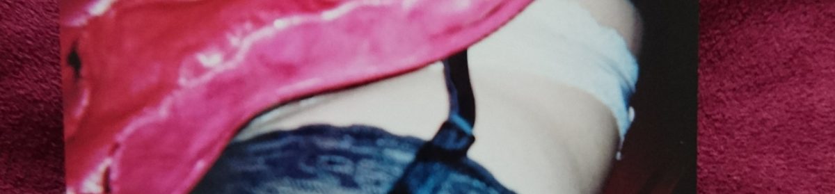
I even planned on making cupcakes with vagina-looking toppings and teeth inside, but decided to stick with the vagina sculpture instead. I believe that I made the right decision because it turned out just as I wanted it to, and captures my inspirations for creating this piece very well. I painted the vagina pink and red, symbolising flowers and roses, which sort of links to my first idea. The teeth inside has fake blood all over them, creating the idea of women fighting back against rape culture. Here are images of the piece while I was creating it;

And here’s the finished final piece;

I made the vagina look imperfect and even made the teeth gappy and look irregular to highlight the extreme measures women go to to have the ‘perfect’ body, even getting their labia trimmed, when having ‘imperfect’ bodies are perfectly normal. I decided to make it a dark pink, which resembles an actual vagina, but also fits into femininity and flowers which is something I’ve been using a lot during the year for the Inside/ Outside project. I do believe that is resembles a flower, which is what I originally planned to make, but the cracks and ridges of the clay definitely looks better on a sculpture of a vagina, as it creates a more realistic look to it.

Shaped Painting Developments – My final piece

I’m experimenting with more abstract shapes and paintings after looking into Dorothy Iannone, as she uses a childlike style and concentrates more on what the piece is saying, rather than it’s beauty or skill. I decided on playing with colour and using layers and layers of shapes, after looking through my sketchbook for inspiration from past doodles. I corresponded Frida Kahlo and Dorothy Iannone in these pieces, form Kahlo’s use of nature to Iannone’s use of abstract women and their purpose in the piece.


This piece has turned out larger and busier than any other shaped painting that I’ve done, even though I haven’t taken as much time on the finer details, rather spending that time on the different shapes and colours. I used parts of the body that are deemed too ‘sexy’ for places such as schools (shoulders, legs) as well as breasts that are sexualised when they exist to feed babies. I combined them with nature, once again, to take the girl/woman’s body back from this, especially by the use of roses, as they are often used in poetry and films (American Beauty being one, where a sexually frustrated father has a mid-life crisis after becoming infatuated with his daughter’s best friend), thus was used almost ironically. I feel that the use of nature in my pieces work really well, as they are often dramatic and, at first, look like something from a William Blake poem. However, the aim is that they show how femininity and women’s bodies are natural and far from having to be hidden, unless chosen to be.

Silhouetted still lives

In this collaborative project, I worked in cross-discipline teams of four and explored the effect of light, shade and shadow on a three-dimensional form. Each member of a group was tasked with making a distinct contribution to a ‘still life’.

Our group started off by playing around with what shadows different objects created by placing random objects onto a projector and then sketching the shadows down, as well as taking pictures on our phones.

As we were moving the objects around, we found that the shadows resembles faces, especially the expressions of a face by using the hands to cover it. I realised how interesting these shapes were and we decided to take it a step further by looking at the objects from a different outline, which was above, and draw out the outline of the landscape they created, which is below;

16790847_1367123400000838_275649979_n

We considered making a few things with the landscape idea, such as looking into how a lung’s landscape looked, but we decided to stick to the actual landscapes the objects created. We then began working on our ideas by using cardboard and paper to create an interesting collage. We didn’t stick to a ‘normal looking’ collage, because we wanted to see how our ideas would actually look and if they’d work. We used the outline of the landscape as the main piece but added strips of paper in between to see if they created more interesting shadows;

We then went on to using clay. We decided that the strips down the middle weren’t necessary and wanted the landscape be the main focus as well as what would create the interesting shadows. We cut out the landscape pieces by using the cardboard as a stencil, smoothed them out and then stuck the negative piece (the other side of the clay we used to cut the shape out of) by using leathered clay. This is the end result, which I’m extremely happy with;

I’m happy with these because the shapes, if interpreted like I have, look like bodies and faces, especially when playing around and putting them together or looking at them from different angles, which relates to the shadows right at the beginning. We’ll be looking into developing these pieces by using photoshop to make them appear much larger to see what effect they’d have if people could walk around them and peer through the shapes and gaps.

We were able to do this and also added a figure next to the sculptures to see what the size of them would look like next to people;

16924086_1373244776055367_26045284_n


Light is colour

In this collaborative project I worked in cross discipline teams to create a series of screen print and paper sculptural objects that are animated through the interaction of colour. I was then introduced to screen-printing as a vehicle for colour interaction and how colour can generate spatial illusions, ambiguities and optical movement.

The first thing we did was actually look at colours and which ones contrasted each other,as well as what colours contained other colours and how to bring those colours out of them. For example, bringing the red out of purple by having red behind/next to the purple.

Bearing those colours in mind, we headed to the print studios and started to plan out geometrical-themed prints. Me and my group agreed on using mainly triangular shapes as they are interesting to use by being able to alter their shapes and still being able to fit them together;

After preparing the screens for the prints, we began choosing paper that would compliment/contrast the paint we had made earlier in the day. We first made basic prints to practice with and make adjustments if needed and to test out how the colours looked together. We then proceeded to overprint by slightly moving the paper before printing which left a 3D effect, or by placing the paper in completely different places to see what patterns it created. As well as overprinting, we tried out using different colours at the same time, which created interesting ombré effects, resembling sunsets/sunrises when we used red and yellow, for example.

After getting all of these prints together, I started planning what to do with all of them. I looked at Frank Stella’s work which inspired me to make a sort of 3D collage.

I wanted to use the idea of cutting out abstract shapes and putting them together by choosing what contrasted well, using colours and shapes. I also wanted to make it more interesting by using both sides of the paper to create a 3D collage so that it almost becomes a sculptural piece. This is where I’m currently at with the piece;

16923580_1374756172570894_1122765265_n

I’ve started to experiment with the colours and looking into making the prints come out of the page on one side. I’ve also decided to show some colour from underneath by cutting out shapes on a print that’s stuck on top of it. I think this develops it by adding texture to the flatter areas. I will be looking into adding more layers by cutting out more shapes and then move on to the other side, then perhaps add string to the top to make it kinetic.

This is exactly how I went with it and I’m very pleased with the result. It’s kinetic from the string and bursting with contrasting shapes and colours, creating an all-round “moving” object. The two-sided aspect creates something a lot more interesting in comparison with just a one-sided collage, and also sculptural, which is what I was intending on creating. We then formed as a group once again and wanted to look into layering the prints and see what we could form from this. We then agreed on cutting pieces from the middle to create a geometrical landscape;

16997025_1376779439035234_1344239594_n

We stuck to using many triangles to compliment the triangular shapes on the print but contrasted the colours to have the layers stand out. I’m really pleased with this outcome, as it’s simple but definitely has depth, making it a very eye-catching piece, with the front print almost framing the landscape, creating a ‘finished’ look to it.

Field group work: Fairytales, Sexual Assault and Trump.

Me and my group of three joined our Inside/Outside themes and ideas, which were sexual assault, feminism and fairytales. We came up with using fruit because they are used as metaphors in fairytales such as Snow White as well as metaphors for purity and sin, which corresponded with misogyny and assault because people who are assaulted are portrayed as having their innocence and purity taken away from them. We used the purity and sin of an apple to sit on top of a white plinth because both are elevated in life as well as stories. We then circled the plinth with bananas which had facts and quotes written on them: facts about sexual assault and rape, and misogynistic quotes from politicians. This worked really well because the writing on the bananas turned black, which could then be seen as a metaphor for how the words are rotten.

We then joined with another group and added the theme of mental illness to our work. We only took the bananas from our work in order to do this because bananas have a protected layer/skin over it which could be a metaphor for hiding one’s mental breakdown or illness. We also wanted to use the bananas as phallic imagery and made a short video of us bashing the bananas with a hammer and added red paint to look like blood. This was meant to represent the perpetrator becoming the victim, as the phallic imagery represented the politicians who’ve said horrific things concerning assault, as well as having cases filed against them. We then nailed the three bananas up on the wall against a white background and played the film on a projector in the background;

We then decided to develop this but in a very different, simpler way, as we felt that our final piece had already reached a conclusion. We wanted to fill a room full of bananas and an effective way of doing this would be by using paper and cardboard. We wanted the metaphor of the banana to be in your face by using numbers. Here’s how it turned out;

Sketchbook work

My sketchbook drawings and paintings are very much the most important part of the development of my work as it’s where all of my ideas go. I prefer to use pens, pencils and watercolour paint to generate my ideas because they offer the quickest way to get the ideas down.

Below are the monoprints I made with Tracey Emin in mind, focusing on her feminist work. I decided to look into the issue of consent and how many people don’t realise what receiving consent really is. I used models from magazines as the women in the drawings to emphasise how what a woman is wearing doesn’t give consent to anything. I used Tracey Emin’s drawings of the human body here as a starting point, as well as her use of text to strengthen the piece and its message. I used text such as, “silence is a no”, which describes how an unconscious person can’t consent. I also looked into Yazidi women who are fighting a war against ISIS because they are currently targeted by them to be raped and killed. I found images of two women in this fight and made monoprints which I believe are powerful because of their background stories.

I also made use of three canvases I had to make sketchbook related work, but more detailed and something in between my sketchbook drawings and shaped paintings, which show the development of my work more clearly. I used collage, text and acrylic to create these political pieces that are about society and cosmetic companies, women’s opinions and women’s magazines.

These are my quick sketches and drawings that I’ve made that might become further developed work, such as shaped paintings, in the near future. I prefer to create as many different drawings and shapes before creating too much developed work because I change my mind a lot and I don’t want the work to not fit well together.

I based a lot of these drawings on the female body and how we are primarily the ones who are shamed for showing it. What inspired me to make these drawings were Piers Morgan’s tweets; “Here’s deliberately flashing her knickers on  red carpet. Another triumph for feminist empowerment!”. What she’s advocating is exactly what feminism is; the right of choice and freedom to do whatever you please with your body because bodies aren’t obscene and it’s not 1805. He’s also tweeted about her that she must “secretly fancy” him after similarly judging a naked photoshoot she had, which is indeed very creepy. I decided to draw women posing and taking pictures of themselves, which many people, particularly men, say they “hate” over social media. However, I and many other women don’t take pictures of myself to get an approval, as it simply shows that we’re perhaps in a good mood, or excited about something, not that they should even have an explanation.

I also experimented with lace and nature together in my sketchbook, as nature (flowers, trees, etc) are commonly used as metaphors for the female body, which then adds a seductive nature to the leaves and flowers I collected. Georgia O’Keeffe is who inspired me to look into nature to connect with the female body, which then lead to drawings of women lying down, hugging flowers and plants, in their underwear for. This idea was mostly from how people relax in comfortable clothing such as underwear, and usually alone, because a relaxed, comfortable state isn’t deemed appropriate in public, no matter how many times a woman will be compared to a very natural and naked flower.

An example of O’Keeffe’s work;

220px-georgia_okeeffe_series_1_no-_8

Side project on landscapes

Since looking into John Stezaker from the material project ‘Today, Tomorrow, Yesterday, September’, I’ve been generating ideas form making landscapes of where I live, which is Snowdonia. This has been very useful in making me work and be productive for my main project, as well as letting me experiment with different styles of painting.

7e9c87a72aa254b54c5e4184f56b7fad

An image by Stezaker of Betws-Y-Coed, near where I live. 

Where the development of my work is currently at.

dev.png

To begin with, I used overlaying editing to create a layered collage of my drawings of “selfies” that have received negative and/or vulgar comments (one being mine) and a drawing of a plant to go with my theme of using ‘pure’ imagery of natural things that are used as metaphors for women. These are to prepare for my large scale collage shaped paintings that’ll all correspond with this theme.

I’ve made actual drawings for my plans below;

I’ve been focusing on using a mixture of innocent and sexual imagery used by plants, for example, white flowers and red flowers, but without using any colour (at the moment) to develop the metaphor of women being seen as sexual objects but aren’t allowed to behave sexually, unless it’s only for the male gaze.

My next task will be to try a few of these collages out with board and progressively develop them into larger pieces. I will be adding colour to these pieces to strengthen the flower imagery and how people, especially women, are scrutinized for taking pictures of themselves, whatever they choose to show.

Again, I’m looking into what Piers Morgan has to say over what women can and can’t do with their bodies. He’s commented on how much women should show in photographs, such as very recently, when he said that Madonna’s image of a tattoo on her lower abdomen made him feel ill. (https://www.thesun.co.uk/tvandshowbiz/2604362/madonna-tweets-racy-picture-of-vagina-tattoo-but-piers-morgan-isnt-impressed-as-he-admits-i-just-threw-up/)


Material Projects and what I learnt from them.

I participated in the material projects Today, Tomorrow, Yesterday, September, Concertopia and Shaped Paintings. They all offered very different skills and ideas, all of which I’ve used since in one way or another.

My first material project was Today, Tomorrow, Yesterday, September and I learned about print making and the different sort of printmaking I could make, and quickly, which will be tremendously useful for planning and sketchbook work I’ll be doing in the future. I also learned about monoprints, however I didn’t get a chance to try it out but I’ll certainly include them in my work for Inside/Outisde because the effect is very aesthetically pleasing as well as it having a powerful potential. I also found out about the artist John Stezaker who uses landscapes as well as photography in his work, which are beautiful and powerful by usually being two romantic, but totally different, images emerged together; a process so simple yet very inspiring.

14600784_1236831673030012_1147117101_o

For Concertopia, the most useful tool I gained from it was using psychogeography, which is an approach to geography that emphasises playfulness and “drifting” around urban environments to find interesting objects, which could potentially be very useful for my work. I’m definitely looking into using photography because I finally got to use photoshop and it turned out well. I’ve also been looking into artists who use photography, such as John Coplans who uses many black and white photography of himself, and I’m very interested in the effect they can have, especially when using photoshop to amplify the effect.

thumbnail_concrete-photoshop2

The one I enjoyed most was Shaped Paintings because it attracts me to make something from scratch in the way you make a shaped painting. It’s never a blank canvas because it’s already a piece once you’ve cut out the shape(s) and it could still turn out completely different to your first idea. They can also be incredibly powerful to use for art pieces because they make such strong statements from being a shape, rather than a rectangle shape, which is very useful for my political pieces and a useful thing for me to have learnt from this project. This project also lead me to many feminist artists that I’m still currently, such as Dotty Attie and Ilona Granet, who use materials from text to detailed paintings, giving me a huge variety of ideas to play with for my Inside/Outside project.

14740961_1258793647500481_479660147_n

My most developed piece

I wanted to include a shaped painting I believe is the most developed as well as one of my most recent sketches because it’s what I’m planning on doing next, which is a development in itself.

The first one is a front side of a woman, the back of her and the female reproductive system covered in thorns. The front of the woman has an opening full of roses to represent the woman as something natural as well as the stereotypes/standards such as “an English rose” that signifies beauty, fragility and purity. The reproductive system links to this because I added thorns to the tubes, showing strength and perhaps dangerous side to women, which hasn’t been seen in the media until very recently. The woman’s back represents someone revealing themselves, for example, in photographs, thus showing their sexuality and being allowed to.

The shaped painting is half a self portrait, half a portrait of all women. I mean this in the way that it looks like me, but represents my freedom and the freedom that all women should have. I tried showing this by using sunglasses because it’s an obvious “easy going” look, as well as having a darker side or meaning, which is exactly how I see women’s rights at this point in time. I wanted to display how many women in Western countries are much freer than other women in perhaps poorer countries, showing how there is still a lot of work to do before women are treated totally equal. However, this does not mean that Western countries offer women freedom within some subjects, such as abortion, as they don’t allow women to receive education in Pakistan which made headlines recently when the Taliban shot 15-year-old Malala Yousafzai in the head for pursuing her right to learn.