Evaluation of my Field experience

I believe that both field projects have been hugely successful and I really enjoyed the entire process. My work has always revolved around politics and are never abstract, which can be quite restrictive after a while if I want to go outside my comfort zone because I find it difficult to know how to do that. Things Behind The Sun let me do this easily by letting me look at landscapes and draw extremely quickly in challenging weather, forcing me to draw what I saw, which enabled me to see my drawing style and came out with 5 drawing motifs to work with in the print studio. Being able to see these abstract new styles led me to look at artists that I had never considered before, including Vija Celmins and Eduardo Chillida. Vija Celmins uses monochrome and simple objects in her work, like the sea, but they can offer incredibly deep meanings that are open to interpretation, such as man-mad waste within the sea. This let me think more about how I could create work that doesn’t have to be obviously at politics, but more about letting people look at it for longer to offer a meaning themselves. This would in turn perhaps make my work even more political. Chillida uses simple, geometric shapes, which is something that came out of my motifs and helped me create more abstract pieces. I’ll definitely be using these techniques in the future throughout all of my modules, especially in subject and field.

In the Relational Colour module, we successfully completed a ‘Bryan Wynter’ box, which became hugely useful for my final subject piece, and over twenty different slides together, as well as a variety of different hanging pieces. I was initially unsure about working very precisely and having to measure and plan things out because I’m never inclined to do so with my own work. However, I found that I did enjoy the process and that the finishing outcome of what we made looked very professional. I started my thought process to get ideas by looking at artists, mostly Howard Hodgkin and his work “After Visiting David Hockney” (First Version), 1991, because his work is totally expressionistic and relational. I was really interested in how he created depth in his work, while only using flat surfaces, therefore I decided to play on this idea during this project. I also wanted to use colour in an interesting way, therefore I also researched into Frank Stella, and his piece ‘Hyena Stomp’, 1962. He’s used contrasting colours that aren’t completely aligned, further contrasting using the lines and pattern, something I enjoyed experimenting with during this project.

This project also unexpectedly made me realise what I really enjoyed about working with colour and shapes, which was the optical illusion aspect of it. I further researched into artists who made work around this, such as Oleg Shupliak, whom I’ve never come across before, although could really help me in my subject work, as I like working around metaphors and political issues. Using illusions could definitely help me convey my ideas interestingly, and help it be not quite as obvious as I had previously been working. I printed on fabric and made prints to convey all of these ideas in a workshop, and I decided to make as much work possible to be able to have a huge variety of pieces to use for the slides in the box.

I believe that I’ve never had such a successful outcome while working as a group, and I’ve initially always tried my best working independently because of previous failures. However, working with this group has made me want to carry on working with others, and perhaps even work collaboratively in my subject area with people who work similarly and differently to me, as group work seems a lot less challenging after this project.

Overall, I had an amazing time during these projects and I learned a lot of new skills, for example, the fabric printing and lazer cutting, as well as develop old ones that will be very useful to my future work, such as working collaboratively to create exciting pieces of work.


Project summary

I believe that this project has been hugely successful and I really enjoyed the entire process. We’ve successfully completed a ‘Bryan Wynter’ box and over twenty different slides together, as well as a variety of different hanging pieces. I was initially unsure about working very precisely and having to measure and plan things out because I’m never inclined to do so with my own work. However, I found that I did enjoy the process and that the finishing outcome of what we made looked very professional. I started my thought process to get ideas by looking at artists, mostly Howard Hodgkin and his work “After Visiting David Hockney” (First Version), 1991, because his work is totally expressionistic and relational. I was really interested in how he created depth in his work, while only using flat surfaces, therefore I decided to play on this idea during this project. I also wanted to use colour in an interesting way, therefore I also researched into Frank Stella, and his piece ‘Hyena Stomp’, 1962. He’s used contrasting colours that aren’t completely aligned, further contrasting using the lines and pattern, something I enjoyed experimenting with during this project.

This project also unexpectedly made me realise what I really enjoyed about working with colour and shapes, which was the optical illusion aspect of it. I further researched into artists who made work around this, such as Oleg Shupliak, whom I’ve never come across before, although could really help me in my subject work, as I like working around metaphors and political issues. Using illusions could definitely help me convey my ideas interestingly, and help it be not quite as obvious as I had previously been working. I printed on fabric and made prints to convey all of these ideas in a workshop, and I decided to make as much work possible to be able to have a huge variety of pieces to use for the slides in the box.

All three of us had been working independently at this point which was great because we all created a large amount of work that were all very different to one another. This meant that we had to figure out how to make our work ‘work’ together, which lead to narrowing a lot of our work down. This worked really well because we all had an equal amount of work put into the slides and they were all efficiently working alongside each other, proving how efficiently we were communicating and working together, making the entire project work smoothly. I also believe that I’ve never had such a successful outcome while working as a group, and I’ve initially always tried my best working independently because of previous failures. However, working with this group has made me want to carry on working with others, and perhaps even work collaboratively in my subject area with people who work similarly and differently to me, as group work seems a lot less challenging after this project.

I will definitely carry on with working with colour and bring many ideas that I’ve gathered from this project to my own work. The use of colour was never important to me before this project, therefore being able to use it primarily to create the overall effect has really opened my eyes to using it carefully. This will further add to using a more abstract approach to my future work, such as the optical illusion aspect that I really enjoyed.

Overall, I had an amazing time during this project and I learned a lot of new skills, for example, the fabric printing and lazer cutting, as well as develop old ones that will be very useful to my future work, such as working collaboratively to create exciting pieces of work.


Relational Colour – 14/02/18

This was our final day of working, and we spent it finalising and planning our compositions. We made a few compromises, such as not including a few hanging pieces that I made (which are below) because they didn’t fit in well with the slides we’ve created, and decided to use only circles to hang instead, tying in the work extremely well;

We then went on to planning and noting our compositions, working out which ones we liked best and what we’d like to include in our final ten. This took a while because we really liked so many, making this a tough decision, however we were able to discuss it and got a great variety of compositions. These were some of the photos we took to document;

Here are pictures of our sketchbook planning and choosing;

We also took a few videos, which capture the shadows and optical effect our compositions created and we wanted to be able to show this because the photographs couldn’t quite capture how interesting some of them turned out;

However, we narrowed the compositions down to these;

Relational Colour – 13/02/18

We’re heading to the final stages of our box now and have completed the slides. We only need to figure out the ten different compositions and take pictures of them in the dark room, using different coloured lights from a variety of angles.

dsc_0085245747587.jpg

I also had a chance to make final prints on a mesh fabric because we decided to have more slides that we could place at the front of the box. They actually turned out to look brighter than I thought they would, but still remain transparent, making it a great last success.

This is one composition we’re thinking of including because we felt that the different shapes and colours from the circles really went well together and created a very interesting illusion of blending in together, despite being different sizes and colours.

Relational Colour – 08/02/18

We based today on choosing the slides, making them and planning what would look best with what. This was really helpful for us because it helped us figure out what we had left to do and how much time we needed to do everything. I experimented with a print I made yesterday and cut out the shapes, making it transparent enough to be able to see prints behind it;

Here’s a video of one of our compositions using four prints;

How the lines join from some angles and how they disappear in some others really intrigue me because how the piece is perceive is entirely down to where you’re standing, making it almost an optical illusion in ways. It also makes this interactive art, as it makes the spectator have to move around with it to see all its shapes and illusions. This work resembles Victor Vasarely’s work with the use of lines an colour, which is an artist I’ve already been looking at, making me think that we were subconsciously thinking of these artists while making the work.

This has had me thinking abut my own work in subject, and how I could incorporate these ideas and artists into my political pieces. I’m already working with fabric, but I’ve never made them myself, which could be a great starting point. I could also look into optical illusions by using more metaphorical and abstract pieces to convey my ideas, like how Oleg Shupliak uses his paintings to capture illusions. I could use this in my sculptural pieces by using two different ideas that all link to my political points.

Image result for Oleg Shupliak

Relational Colour – 07/02/18

The frames have now been painted blue to match the interior of our box, and I also had time o create new prints, by printing my other pattern onto coloured backgrounds and a few of my previous prints;

The two patterns are totally different to each other but really worked together, as if they were made together originally. We wanted to use some red to be able to contrast with the blue interior and frames, as well as match the outside of the box, which worked really well when we took our box into a dark space and started experimenting with some lights, including coloured ones. This is the link to the video of experimenting with light in natural lighting; https://youtu.be/zITy6yko47w ; And this is to the video in a dark room; https://youtu.be/zf4h3KtfaU0 .

I also took images of the shadows that were created with a few of the slides;

These were really beautiful to look at, but it also distracts away from the colour contrasts and the shapes form the prints, which makes it debatable whether we want to keep them or not, however they were still interesting to play with.


Relational Colour – 06/02/18

We’ve made huge progress in collaborating our work and ideas, and have even started on the slides and thinking about the compositions. I also had time to make a print of my own, which is below;

I chose the three colours orange, black and green because I wanted to see what would happen if I separated two contrasting colours by adding such a statement, block colour in the middle. I think the effect is really interesting, especially as I made a few of them and the colours began mixing into each other, making the contrasting colours come even closer together. I also like how the contrasting patterns look next to each other, because I’ve given the print some ‘order’ by splitting them up with straight lines that makes the print make more sense by helping it look finished.

We were looking at how to organise the slides, because a lot of our work’s not translucent, therefore we needed to work out how to be able to use them and also see through to the other slides. We figured out that we could use some clingfilm and stick some of our work onto that, and also by cutting out shapes and halving prints, creating almost 3D and ‘floating’ compositions.


We still have about half of the slides to make, and we’re also planning on painting the frames blue to blend in entirely with the inside of the box. There has also been some experimentation with cutting out shapes and having them hang onto other prints, or from the plastic lid, creating movement and shadows. We’re also going to experiment with coloured lights and move them around with different compositions to find the ten most complimentary and interesting collaborations of work.


Relational Colour – sketchbook work

Here are a few pictures from my sketchbook that I’ve been keeping for this project, containing lots of different ideas, plans, artists, and colours, which have all inspired my work and influenced my working process, since I don’t regularly plan my work but has definitely helped during this project. Being able to draw out my ideas also made it a lot easier to explain and communicate with my group.


Relational Colour – 1/02/18

T 
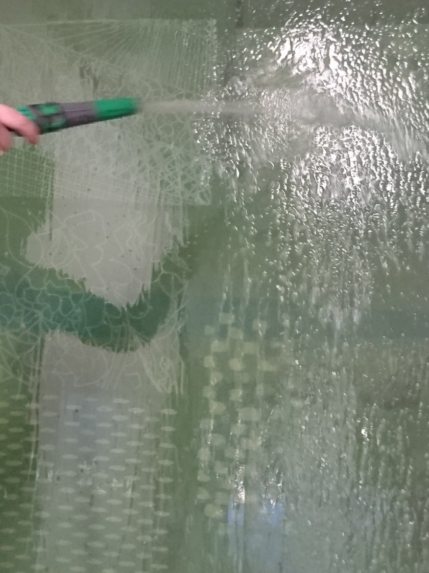
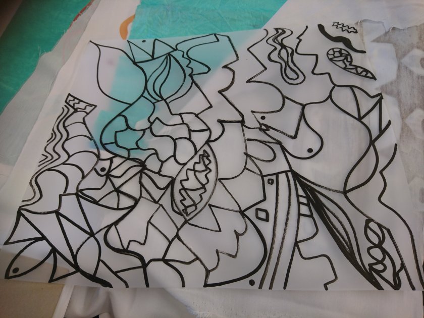
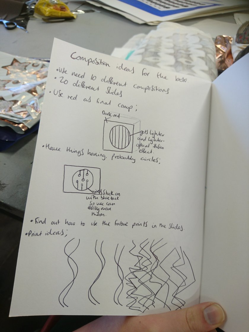
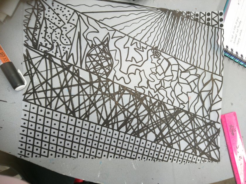
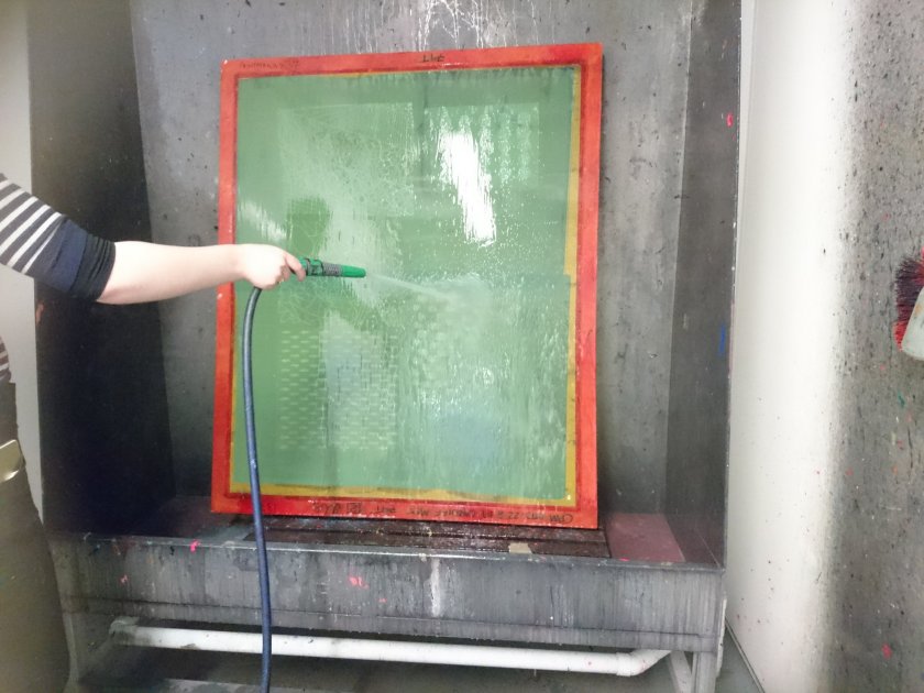
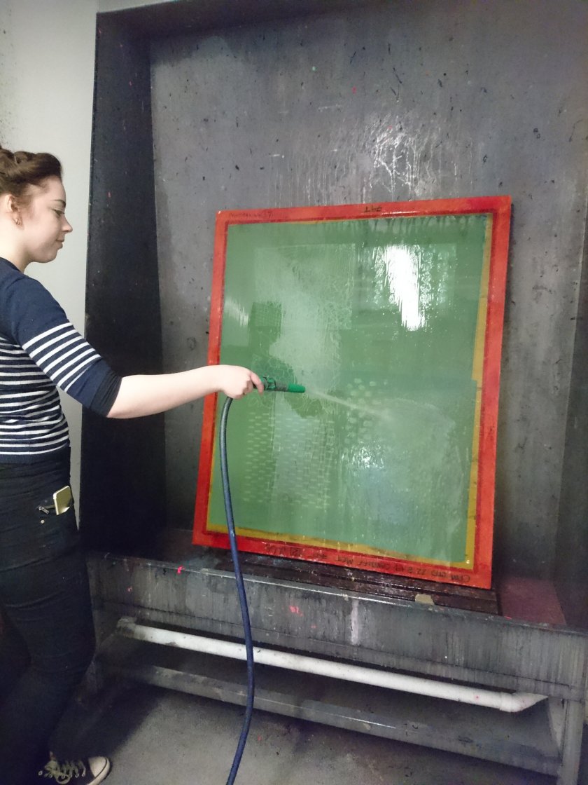
oday, I was able to participate in the print room with the rest of my group, and we shared ideas on how to execute the box, including the 10 different compositions using 20 different slides, and perhaps a “finished composition”. I decided to make a few designs to print on paper, in order to have a good variety of pieces to play about with and compare different compositions. I also wanted to keep with a mixture of solid geometric shapes, as well as more expressionistic patterns so that they’d already be contrasting.

Relational Colour – 30/01/18

We experimented a lot with lazer cutting today, and I learned a huge variety of ways of using my lazer cut out, such as the different glues I can use to stick fabrics down onto the exposed areas from my lazer cut, heat activated mixes that rise when steam is applied, and other printing techniques. They all took quite a while to get through, which was the downside to them. But once you have your lazer cut out piece, the possibilities are endless, which is something I really liked about it. I especially liked the heat activated mixture because it left a foamy, sponge like designed, and the process was really interesting to look at. I also really liked the rose gold pattern design I made because they looked almost “professionally” worn, as if the accidents looked on purpose.