The relationships between colours and the optical effects that can be generated by them are a fundamental aspect of Art and Design practice. In this project through lectures and seminar discussions we will be introduced to relational colour theory, its contemporary and historical application and relevance to art & design.
This knowledge will be tested and explored by us through hands on experience in a series of practical workshops using both paint and screen-printing that will expose the potential that this in depth knowledge of relational colour can bring to our own practice.
Patrick Heron, “9”, 1950-60s. Flat, contrasting, expressionistic, abstract – inspired by landscape – not completely abstract as it links to reality.

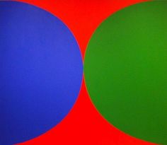
Ellsworth Kelly, “Blue, Green, Red”, 1965. Deep tones of colour, flat, mechanistic – no brush marks.
Daniel Batchelor, “Orange”, 10.01.11. Black square – plinth – 2D sculptures – very textured.

“Reef”, 2016 – lots of colour overlay and mixing.

Tony Cragg, “New Stones – Newton’s Stones”, 1978.

Howard Hodgkin, “After Visiting David Hockney” (First Version), 1991 – Suggests depth, but is totally flat. Is expressionistic and relational.

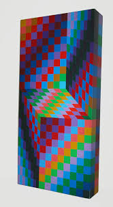
Victor Vasarely, “Vega”, 1965″ – they look perfect but aren’t when you take a closer look.

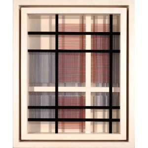
“Bidim, MC”, 1988.
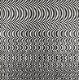
Bridget Riley, “Fall”, 1963 – You can almost see pink when you stare at it – optical illusion.
‘I try to organise a field of visual energy which accumulates until it reaches maximum tension’, Riley said of this work. From 1961 to 1964 she worked with the contrast of black and white, occasionally introducing tonal scales of grey. In Fall, a single perpendicular curve is repeated to create a field of varying optical frequencies. Though in the upper part a gentle relaxed swing prevails, the curve is rapidly compressed towards the bottom of the painting. The composition verges on the edge of disintegration without the structure ever breaking.” (By Gallery label, March 2010)
We looked into how different colours impact each other by cutting up strips and placing them next to contrasting and complimentary colours. I took a few pictures of the experiments I did;
I noticed that even moving colours further back from other colours really had an effect on how I perceived them to look. For example, the colour that surrounds the circles is meant to be purple, but looks like electric blue when I added these colours. After experimenting, I decided to create an abstract piece with a few of these strips of colour;

We also looked into a few pieces Tom had made over the years that looked further into relational colours;
We then moved on into groups of pairs and painted a colour from the colour wheel and the pair’s colours had to be completely contrasting. Me and my pair used a light green with an almost pink red. We then painted 10 sheets of paper each, each time adding a little bit of the opposite colour that we had. This is how they looked in the end;
We then, as a class, put all of them down and created a colourful grid of contrasting and joining colours;


 Another artist who caught my eye was Jesus Rafael Soto and his work ‘Cardinal’, 1965, who contrasted by only using black and white, which has just as an illusionistic effect on its viewer.
  I also researched into Frank Stella, and his piece ‘Hyena Stomp’, 1962. The title Hyena Stomp comes from a track by the American jazz musician Jelly Roll Morton. Stella was thinking about syncopation while working on the painting. He’s used contrasting colours that aren’t completely aligned, further contrasting using the lines and pattern. I’m interested in using this effect when we complete our box and use it for one of the colour slips inside.
  We then proceeded to look at each other’s work from our previous session, and found that we all created successful contrasting pieces of work, and I saw that there were very strong pieces of work from which colours they chose to use against each other and how powerful the use of colour is to a piece.
 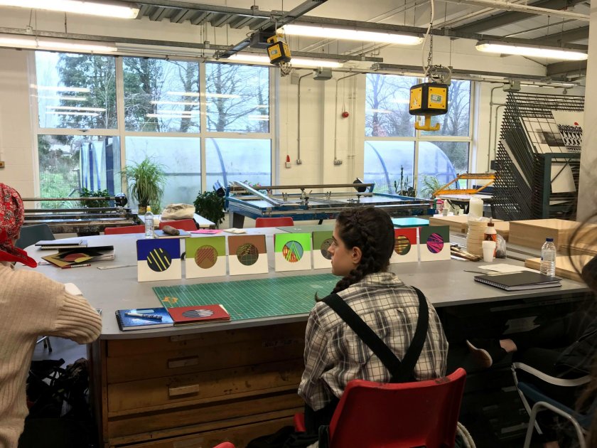 Before lunch, we watched Laura create a box and then made one ourselves. This certainly developed my concentration skills from the precise measuring, nailing and gluing. We attached four spaces inside the box for the slips that we’ll be making on Thursday and are planning on using them for the colour slips and shapes, as well as hang contrasting colours and patterns from above, using a clear plastic sheet to hang them from. We’re also going to paint the inside and outside of the box to further develop the illusion, by painting the inside a deep blue and the outside a watermelon red.


 (All images and information are from


