We, as a class, looked at different ways of exhibiting work and how to build art from the space you’re working with, be it large or small. We looked at artists, from our own students at Cardiff School of Art and Design like Melissa Mavroudis Stephens (L4) to those who decided to go beyond the planet, such as Forrest Myers in his ceramic chip piece to the moon, titled ‘Moon Museum’, 1969.

We all had a box each and planned out ideas on how to use them to exhibit our work, and then use them later on during this project for our locker exhibition. My immediate idea was to create a room in the red light district, since I visited last winter and have quite a few opinions on them. I really like the idea that the sex workers are genuinely cared for and have laws to protect them, and I also like how they make money from ‘playing’ the objectifying game, that’s usually against women, to make a living. I’ve started quite a few sketches and I’ve already painted the outside of my box black, and the inside red. I want the inside to look as comfortable as I can – almost like a home – to emphasise how much safer women are when sex work is legalised.
I started by making plans in my sketchbook of what I was planning on making for my “red room2, including curtains, a bed, photographs, etc. I also planned on using luxurious fabrics to add to the sexual feel of the room, including black lace and red velvet.
I started the box by making sure it was sturdy by taping all of the fragile areas, then proceeded to paint the outside black and the inside red with acrylic paint.
I began by making my framed photographs of various humorous images I found online, including a women with very large breasts, a man with “moobs”, a rat positioned as a phallus and an “I Love Penis” sign. I also decided on making the curtains out of lace, which plays with fetish, eroticism and teasing.

I hung all of the photographs on the back wall to enable them to be visible for all viewers, then created a bed out of cardboard and red velvet fabric, with red velvet and black lace pillows. I was also playing with where the mystery woman was going to stand, positioning her in various areas of the room and debating on giving her features of painting her entirely black, creating an ambiguous character.
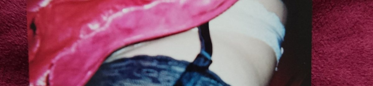
I finally decided on painting her black, almost letting the viewer become her if they wished to, making her character relatable and fit well with how sex workers are dehumanised in countries that make them criminals. Below are images of the final display I made;
I tried taking pictures using a red light, which worked by making the inside look eerie and mysterious, but it didn’t show much of the room, leaving me undecided about how I want to exhibit the piece. I might invest in some red neon lights and take pictures with them inside, which should give a really intense look to the images.

We, as a class, looked at different ways of exhibiting work and how to build art from the space you’re working with, be it large or small. We looked at artists, from our own students at Cardiff School of Art and Design like Melissa Mavroudis Stephens (L4) to those who decided to go beyond the planet, such as Forrest Myers in his ceramic chip piece to the moon, titled ‘Moon Museum’, 1969.
We all had a box each and planned out ideas on how to use them to exhibit our work, and then use them later on during this project for our locker exhibition. My immediate idea was to create a room in the red light district, since I visited last winter and have quite a few opinions on them. I really like the idea that the sex workers are genuinely cared for and have laws to protect them, and I also like how they make money from ‘playing’ the objectifying game, that’s usually against women, to make a living. I’ve started quite a few sketches and I’ve already painted the outside of my box black, and the inside red. I want the inside to look as comfortable as I can – almost like a home – to emphasise how much safer women are when sex work is legalised.
I started by making plans in my sketchbook of what I was planning on making for my “red room2, including curtains, a bed, photographs, etc. I also planned on using luxurious fabrics to add to the sexual feel of the room, including black lace and red velvet.
I started the box by making sure it was sturdy by taping all of the fragile areas, then proceeded to paint the outside black and the inside red with acrylic paint.
I began by making my framed photographs of various humorous images I found online, including a women with very large breasts, a man with “moobs”, a rat positioned as a phallus and an “I Love Penis” sign. I also decided on making the curtains out of lace, which plays with fetish, eroticism and teasing.
I hung all of the photographs on the back wall to enable them to be visible for all viewers, then created a bed out of cardboard and red velvet fabric, with red velvet and black lace pillows. I was also playing with where the mystery woman was going to stand, positioning her in various areas of the room and debating on giving her features of painting her entirely black, creating an ambiguous character.
I finally decided on painting her black, almost letting the viewer become her if they wished to, making her character relatable and fit well with how sex workers are dehumanised in countries that make them criminals. Below are images of the final display I made;
I tried taking pictures using a red light, which worked by making the inside look eerie and mysterious, but it didn’t show much of the room, leaving me undecided about how I want to exhibit the piece. I might invest in some red neon lights and take pictures with them inside, which should give a really intense look to the images.