Level 4 PDP: Constellation Reflection

I’m very intrigued by the concepts, approaches and theories of Subcultures, and I’ve been considering how they all link, then wondering how I can reflect what I’ve learnt in my own practice. I’ve come to realise that all subcultures (that I’ve looked at, such as goth and hip-hop), uses “Re-Signification” (Whitely, 2001) of objects, which simply means taking an object that already has a function/meaning and give it a different one to differentiate you from the mainstream. Goths did this by using objects, such as corsets, which is supposed to function as underwear, but used them as outerwear. The hip-hop Subculture stole car brand logos and then wore them as medallions. I could consider this through feminism and politics by using stereotypical objects, such as domestic products that are ‘meant’ for women, or positions of power given to women, etc.

What is also apparent in Subcultures is how they use history/heritage and how they recycle old styles/meanings. Goths would use the Victorian styles, but by adding white and black make-up to look dead, while Hip-Hoppers would use sportswear and traditional African patterns together to create a new and very different look that clearly showed where they originated from. I could use this guideline by using my Welsh heritage, by considering historical things that has happened here that links to women and feminism, for example, Plaid Cymru’s leader, Leanne Wood, who often speaks about feminism. The juxtaposition also used by the Subcultures fits into this well because of how they mix up the old and the new, which is also something I’ve been thinking about doing by looking at vintage adverts of how women were portrayed, especially during the 40s-60s.

Zoot suits

Image result for Zoot suits

During the Second World War, a lot of outcast youths who were protesting society’s norms and traditions were expressing themselves through their outfits such as the zoot suits. Zoot suits “consisted of a broad-rimmed, flat hat; a long, draped coat; and high-waisted, baggy-legged trousers with tight-fitting pegged cuffs” (Meier & Rivera, p145). The outfit had excessive fabric and during war it was not seen as respectful or patriotic, as there was a ration on the fabric, which they went against. The zoot suits were mainly worn by African Americans and Mexican Americans, which lead to many of them having to face a lot of abuse. Police harassed and arrested many because of their race and constantly monitored predominantly Mexican and African areas, and the zoot suit offered a poor excuse for them to do so, as using excessive fabric was considered a crime. There are many examples of the abuse they received from the police, one of which was when an officer searched a young man, “they found ninety-eight dollars in his pocket [they] refused to believe that he had earned it” (Obregon Pagan, p121). The sociologist Emory Borgardos stated that only about 3% of Mexican Americans were actually involved in gangs in relation to the zoot suit, but Mexican Americans and African Americans were all portrayed as gang related in the media for wearing the suit. There weren’t a significant number of gangs derived from the suit but there were some, like the famous 38th Street gang, who wore zoot suits (Obregon Pagan, p61). White youths thus started wearing the zoot suit in the name of fashion, but because of the bad reputation they had been given, anyone who wore them were vilified. White youths who wore them was deemed inappropriate to the African and Mexican Americans because the suits existed to signify how these young men wanted an identity and became a symbol for their heritage and ethnicity.

The young men “re-signified” the suits by still using the basic connections of a suit but exaggerated them by using bright colours and making them over-sized. They still held traditional aspects such as the Dutch type shoes and flat hats, but added a walk and particular language to go with the look, making it a racial political statement. This was also a political statement because they were stealing a dress that don’t belong to them, thus re-claiming and making a statement about class in order to “counteract a dominant ideology” (Tullock, 2006, p304).

The idea of re-claiming and “re-signifying” a particular look or dress code happens again and again in history to either mock the upper class by dressing like they did and giving the dress negative connotations or by proving that they are worth more than they were seen as. I’ll be using these ideas in my work by “re-signifying” career paths into simple drawings of male genitalia that covered all of my school’s desks and text books. For example, I’d “re-signify” ‘male’ jobs, such as engineer, and making it equally as female by perhaps the use of prints and photography.

The Teds


It originated from the Edwardian suit and was modified by The Teds. The modifications were all similar to why the lower-class youth in 1940s America made the Zoot suit. The style hair was different cut to the jacket in class standards and was taken up by working class youths, as they were “To contract a dominant ideology’ (Tulloch, 2006:304), which was the British class system. They were made with bright colours, and paired with blue suede shoes, like Elvis Presley’s look. This aristocracy wear adopted by working class men in the 1950s in the East End as a statement about class systems (they didn’t want to conform) and criminal behaviour with the Ted suit gave different name to aristocracy look. Late 50’s saw the development of Ted look: Americana influence. The Ted look came back in the 70’s.
Most subcultures opposed the establishment/ were anti-establishment.

Punk

This week, we looked at between 1977-1980, when the gender wars began by fighting over territory on stage, streets, and the workplace. Femininity was then challenged as punk offered a place for women to express things, such as their anger and rage. If this was done before this, women were often seen as misfits. (O’Brien, 19918: 186-7)

Mainstream femininity was challenged in subcultures, which is what I’ll be looking at in my final essay for constellation and in my pieces in Fine Art by looking into what empowers women. The punk rebellion shaped their gender identity. However, punk’s meaning for women turned to being against them, yet redefining 60s feminism at the same time. This resurfaced in the 90s with grunge and continued to shape women through music and even generally in culture. (O’Brien, 1998:191)

The ideological stance on gender that punk promoted was that you didn’t have to conform to mainstream ideologies, since they went totally against the mainstream establishment. This meant that gender could be questioned and women were allowed to express themselves through their look without being called misfits for doing so.

This rebellion came from the clear guidelines on how to ‘be a woman’ in society. You can’t rebel unless there are clear guidelines on how to behave. Women had to be thin, conventionally attractive, and almost like Barbie dolls. Women who didn’t fit in were the vilified. Punk grew in a sexist climate with a patriarchal society that heavily privileged the male. Punk questioned this and showed that women weren’t second classed citizens. There has always been a female rebellion, but this was now a very visible rebellion; they expressed difference to how women were supposed to look.


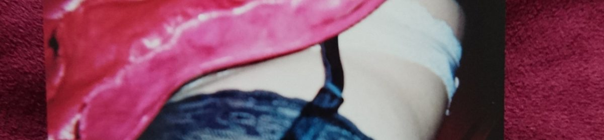
In my essay, I’ll be analysing this through looking at how women have changed post twentieth century subcultures by looking at model photography. I’ll choose three main pictures for this by very well-known and influential brands and photographers and see what has come from the subcultures, what is still changing and what still needs to change in the way we view women. I’ve also been using this in my practice by considering how history still influences the present time by taking ‘vintage’ looking pinhole photographs by using a homemade pinhole camera and pairing the images against comments made on social media, contrasting the both of them. I’ve been taking pictures of a woman’s body (influenced by the Sex Museum in Amsterdam) and putting negative comments by people online about the female body next to them, showing how we still have a way to go before women’s bodies aren’t seen as obscene and come with a metaphorical ‘handbook’.


Silhouetted still lives

In this collaborative project, I worked in cross-discipline teams of four and explored the effect of light, shade and shadow on a three-dimensional form. Each member of a group was tasked with making a distinct contribution to a ‘still life’.

Our group started off by playing around with what shadows different objects created by placing random objects onto a projector and then sketching the shadows down, as well as taking pictures on our phones.

As we were moving the objects around, we found that the shadows resembles faces, especially the expressions of a face by using the hands to cover it. I realised how interesting these shapes were and we decided to take it a step further by looking at the objects from a different outline, which was above, and draw out the outline of the landscape they created, which is below;

16790847_1367123400000838_275649979_n

We considered making a few things with the landscape idea, such as looking into how a lung’s landscape looked, but we decided to stick to the actual landscapes the objects created. We then began working on our ideas by using cardboard and paper to create an interesting collage. We didn’t stick to a ‘normal looking’ collage, because we wanted to see how our ideas would actually look and if they’d work. We used the outline of the landscape as the main piece but added strips of paper in between to see if they created more interesting shadows;

We then went on to using clay. We decided that the strips down the middle weren’t necessary and wanted the landscape be the main focus as well as what would create the interesting shadows. We cut out the landscape pieces by using the cardboard as a stencil, smoothed them out and then stuck the negative piece (the other side of the clay we used to cut the shape out of) by using leathered clay. This is the end result, which I’m extremely happy with;

I’m happy with these because the shapes, if interpreted like I have, look like bodies and faces, especially when playing around and putting them together or looking at them from different angles, which relates to the shadows right at the beginning. We’ll be looking into developing these pieces by using photoshop to make them appear much larger to see what effect they’d have if people could walk around them and peer through the shapes and gaps.

We were able to do this and also added a figure next to the sculptures to see what the size of them would look like next to people;

16924086_1373244776055367_26045284_n


The panoramic pinhole challenge

In this collaborative project worked in cross discipline teams of four to create a panoramic pinhole camera, capable of taking a 360° image which was then augmented with digital content. Mixing together old and new image making technologies, this week long project enabled me to explore and understand light in a multitude of ways.

I began by actually creating my camera; first by getting a small, curved container that didn’t let any light in (we decided to use film containers), aluminium to use as the pinhole lens and tape to stick them together as well as to block the light when not needed. We cut up small pieces of photographic paper and put them inside and began taking pictures. Each paper needed different light exposure times, depending on how bright the area was so we experimented on what times were best for different locations.

17140952_1384794124900432_1468743415_n

What we came up with were different sets of photographs; some worked, some didn’t. We realised that, because they came out negative, they resembled x-rays. We decided to play with this idea for our final piece by looking into skeletal hands. We experimented and found that using ink behind the photograph and then creating a positive of that photo  caused a white drawing effect onto the positive. It even looked skeletal, therefore, we started drawing behind photographs of hands, creating an x-ray look. These are examples of the outcomes;

With these set of photos, I will be using the apps Aurasma and Aguement to further develop them by contrasting the simple photographs with high-tech apps that create 3D moving effects onto a picture you choose to scan. We wanted to stick with the skeletal theme and we experimented by using a few effects the app had to offer, including this;

Light is colour

In this collaborative project I worked in cross discipline teams to create a series of screen print and paper sculptural objects that are animated through the interaction of colour. I was then introduced to screen-printing as a vehicle for colour interaction and how colour can generate spatial illusions, ambiguities and optical movement.

The first thing we did was actually look at colours and which ones contrasted each other,as well as what colours contained other colours and how to bring those colours out of them. For example, bringing the red out of purple by having red behind/next to the purple.

Bearing those colours in mind, we headed to the print studios and started to plan out geometrical-themed prints. Me and my group agreed on using mainly triangular shapes as they are interesting to use by being able to alter their shapes and still being able to fit them together;

After preparing the screens for the prints, we began choosing paper that would compliment/contrast the paint we had made earlier in the day. We first made basic prints to practice with and make adjustments if needed and to test out how the colours looked together. We then proceeded to overprint by slightly moving the paper before printing which left a 3D effect, or by placing the paper in completely different places to see what patterns it created. As well as overprinting, we tried out using different colours at the same time, which created interesting ombré effects, resembling sunsets/sunrises when we used red and yellow, for example.

After getting all of these prints together, I started planning what to do with all of them. I looked at Frank Stella’s work which inspired me to make a sort of 3D collage.

I wanted to use the idea of cutting out abstract shapes and putting them together by choosing what contrasted well, using colours and shapes. I also wanted to make it more interesting by using both sides of the paper to create a 3D collage so that it almost becomes a sculptural piece. This is where I’m currently at with the piece;

16923580_1374756172570894_1122765265_n

I’ve started to experiment with the colours and looking into making the prints come out of the page on one side. I’ve also decided to show some colour from underneath by cutting out shapes on a print that’s stuck on top of it. I think this develops it by adding texture to the flatter areas. I will be looking into adding more layers by cutting out more shapes and then move on to the other side, then perhaps add string to the top to make it kinetic.

This is exactly how I went with it and I’m very pleased with the result. It’s kinetic from the string and bursting with contrasting shapes and colours, creating an all-round “moving” object. The two-sided aspect creates something a lot more interesting in comparison with just a one-sided collage, and also sculptural, which is what I was intending on creating. We then formed as a group once again and wanted to look into layering the prints and see what we could form from this. We then agreed on cutting pieces from the middle to create a geometrical landscape;

16997025_1376779439035234_1344239594_n

We stuck to using many triangles to compliment the triangular shapes on the print but contrasted the colours to have the layers stand out. I’m really pleased with this outcome, as it’s simple but definitely has depth, making it a very eye-catching piece, with the front print almost framing the landscape, creating a ‘finished’ look to it.

Field group work: Fairytales, Sexual Assault and Trump.

Me and my group of three joined our Inside/Outside themes and ideas, which were sexual assault, feminism and fairytales. We came up with using fruit because they are used as metaphors in fairytales such as Snow White as well as metaphors for purity and sin, which corresponded with misogyny and assault because people who are assaulted are portrayed as having their innocence and purity taken away from them. We used the purity and sin of an apple to sit on top of a white plinth because both are elevated in life as well as stories. We then circled the plinth with bananas which had facts and quotes written on them: facts about sexual assault and rape, and misogynistic quotes from politicians. This worked really well because the writing on the bananas turned black, which could then be seen as a metaphor for how the words are rotten.

We then joined with another group and added the theme of mental illness to our work. We only took the bananas from our work in order to do this because bananas have a protected layer/skin over it which could be a metaphor for hiding one’s mental breakdown or illness. We also wanted to use the bananas as phallic imagery and made a short video of us bashing the bananas with a hammer and added red paint to look like blood. This was meant to represent the perpetrator becoming the victim, as the phallic imagery represented the politicians who’ve said horrific things concerning assault, as well as having cases filed against them. We then nailed the three bananas up on the wall against a white background and played the film on a projector in the background;

We then decided to develop this but in a very different, simpler way, as we felt that our final piece had already reached a conclusion. We wanted to fill a room full of bananas and an effective way of doing this would be by using paper and cardboard. We wanted the metaphor of the banana to be in your face by using numbers. Here’s how it turned out;

Trump protest and how it’ll influence my work

I’ve been looking into many politicians and powerful people in the media who are controversial in what they believe in. One of them is Trump, who I most definitely contrast in beliefs. I recently went to a Trump and Theresa May protest that was based on Trump having a ‘special relationship’ with May and Trump receiving an invitation to the UK after declaring the Muslim ban in the USA. These are images from the night as well as the poster I made for the occasion;

I also spoke on the news (S4C’s Newyddion 9) on my beliefs regarding this protest which can be found here (unfortunately there are no English subtitles);

I’ve made some quick drawings with ballpoint pens after looking at marches that were triggered by what Trump has said and done, such as the recent Women’s March, which are below;

I made these after looking at different images from the marches and found a few banners and posters that definitely fit into my work on feminism and corresponds with other misogynistic things have been said, such as by Piers Morgan. The colours blue and red were used on a black and white drawing because I wanted to highlight the disaster of morals and beliefs that are going back to the 1930s that’s happening in the US, as well as how they are also the colours on the Union Jack, and that we’re currently following in their footsteps.