Final Assessment

Personal Statement 

Final Exhibition Personal Statement

Documentation

My ideas and pieces leading up to my final piece

Site Venue exhibitions

Technical skills I have learnt and developed from Relational Colour

My Final Piece

Documenting responses to my performance

Contextualisation 

Davida’s ‘Failiure’ Lecture – 19/02/18

Annie Sprinkle – “Public Cervix Announcement”

Ways of Exhibiting – how artists display and disseminate their work

Women in Focus – National Museum Cardiff

Lynn Hershman Lesson

My Field Experience 

Evaluation of my Field experience

My Final Piece

I began building my box/cubicle recently, with help from Imogen Spurrell, which has been rather challenging. I measured and cut very large pieces of MDF wood to begin with, then glued frames for the screws and screwed them together. In a rush, I glued and screwed the wrong sides, having not noticed until after I had finished. However, this was easily fixed and it is now standing upright, ready to be painted.

I positioned the window hole (cut out with a jig-saw) so that the audience can only see the bottom of my face and my breasts, which will all be part of my performance as a sex object. I’m planning on ‘offering’ to show my large clay vagina for fake money that I’ll supply for the audience to participate in my performance.

dsc_00281268689701.jpg

Performance plan

  • Dress up as a sex worker using online images of the Amsterdam Red Light District for reference
  • Go live on my new instagram page and document the responses
  • Print fake money for people to “pay” for what I perform – excessive amount for something like a smile and a small amount for me to perhaps hold up my clay vagina, etc. (the amount of fake money for gestures won’t make sense or match up to reflect the difference in sex workers’ pay in Amsterdam in contrast with Liverpool)
  • Take pictures of the performance before assessment to show and make it a live performance for the final exhibition
  • Maybe make is interactive in another way? Get friends to bang on the box while I’m inside to reflect the sex workers’ treatement

I began painting my box today, using a liquor black paint for the outside and crimson red for the inside to reflect the Red Light District. I found that the black wasn’t too intensely black, which went a lot better than a true black would against this crimson red, which worked well to reflect the night time atmosphere I wanted. The red is also a very deep and seductive colour, and the significance of red rooms is important for this piece. Red rooms online are dark, torture rooms, red from blood. In Jane Eyre, the colour red in her red room signifies the start of her menstruation, passion, anger, and violence. In recent literature, they’re used as sex rooms, using the colour’s connotations of passion. I will be using the connotations of anger and violence as a contrast, suing the red interiors as the safe place I’ll be stood where the audience can’t get to me, yet is clearly confrontational against the unfairness of sex workers rights in the UK.


I put up the neon lights, spelling out “sexwork is work” after thinking about the most powerful words I could put in contrast with the attractive lights. I believe it will certainly gain attention from the audience, shining a light on their importance. I also positioned the lights to be in the center of the window, making it all you see when I’m not inside.


I decided in the end to use the money idea to convey the absurdity of unfair sex work pay in Europe, using Amsterdam and Liverpool as references.


I also finished the box off by inserting the window, the door curtain and fabric for the roof, completing the box as a dark, enclosed space for my performance and lights.

Before the exhibition performance, I was able to take pictures of what I’ll be doing with a phone camera and a disposable camera, similar to what a tourist would do.


Documenting responses to my performance


Doing this performance at university in comparison to online on social media was more different than I expected. For one, I felt safer and less embarrassed at university than I did going ‘live’ and posting pictures on instagram. I found that people were shy about seeing me at university, which I expected, while a few found it easier to engage with me online, which is seen below. I think it will be interesting to compare more images I put online to my exhibition performance, as I’ll have an even larger audience to show and observe their reactions. I’m very interested in how online, my audience can feel free to be forward about my poses, but I’ve never experienced anything like that in person with anyone, which perhaps might change at the large exhibition. I also had my photos taken of my performance using a disposable camera, as a tourist might visiting the red light district, and I plan on showing these at the exhibition as well as online to compare responses to these, too.


At the exhibition, with total strangers as my audience, I received a very different response to my performance. People seemed to really enjoy it and participated in it freely, asking for prices and giving me the fake money in exchange for a part of the performance. While I really enjoyed doing my first performance piece, I also think I could have developed my idea even further in a completely different way. However, I found that doing this piece was essential for my development as an artist and is helping me realise errors and gaps in my work that I will hopefully fill in my third year.

screenshot_20180614-223000214281707.png

Third Year Exhibition

The third year’s exhibition was incredibly inspiring and all-round amazing to view. I especially enjoyed looking at the Maker exhibition, as they used incredible lights and creative shapes to display them. I found the piece by Amy Perry haunting to look at (below) which looks into the barrier between the body and the spiritual realm we inhabit, that we are not our bodies because they’re only temporary, and instead, we are our spirits.

Grace Cupper in Fine Art had a piece up titled ‘A Self-Portrait In Pink’, which is an installation that uses the materials around her – discarded boards, sketchbook pages and the studio walls – that reflects her thoughts, experiences, dreams, environment, emotions and coping mechanisms through immediate recording.

img_20180526_153455_6671607441635.jpg

Here are other pieces I found wonderful and thought-provoking;


Valie Export – Linz, Austria (b. 1940)

Until the age of 14, Waltraud Lehner was educated in a Vienna convent. As she grew up, she became immersed in the film industry, got married and became a mother. It wasn’t until 1967 when she adopted the pseudonym VALIE EXPORT, both an artistic identity and a personal brand, one that simultaneously rejected the command of the men in her life and challenged the Nazi ideology of her parents’ generation. Her last name was, in part, a tribute to a brand of cigarettes.

“I did not want to have the name of my father [Lehner] any longer, nor that of my former husband Hollinger,” EXPORT explained in a BOMB interview, “My idea was to export from my ‘outside’ and also export, from that port. The cigarette package was from a design and style that I could use, but it was not the inspiration.”

EXPORT’s work in video, performance, photography, sculpture, and computer animation, often critiqued the way commercial film and the mainstream media objectified the female body. “In order to achieve a self-defined image of ourselves and thus a different view of the social function of women, we women must participate in the construction of reality via the building blocks of media-communication,” she said. “This will not happen spontaneously or without resistance, therefore we must fight!”

For the piece featured above, 1968’s “Tapp und Tastkino [Tap and Touch Cinema],” EXPORT crafted a wearable theatrical stage and wore it on the street. She then invited passersby to stick their hands inside the stage and feel, without looking, her breasts. The piece examined the underlying relationship between violence and eroticism, seeing and feeling, private and public. I found this linked with my final piece, but instead of letting hands get into my box, I will be ‘safe’ from the violence highlighted in this piece.

My ideas and pieces leading up to my final piece

My chosen artwork is by Huguette Caland, named ‘Self Portait’, 1971, which is a piece from a series of drawings I saw in the Venice Biennale, which were extraordinarily delicate, intimate ink drawings of female genitalia. I decided to go down the route of using theories discussed in Cath’s Goddesses and Monsters about phallic women and castration fear, which has created an element of humour in my work.

haguettec

I started by drawing her piece and created collage-type drawings of it, which lead to different drawings of vaginas in Caland’s simplistic style.

Firstly, I was having difficulty on how to actually develop such an open piece; I could have stuck with its simplicity and have my work open to interpretation by using delicate drawings, or I could incorporate all that I’ve learnt through lectures this term and create interesting, but rather abstract, set of pieces that could still be open to interpretation.

I wanted to create these pieces without taking the meaning behind them too literal, and have them mean something different to every spectator, which would in turn make my pieces even more interesting to look at and discuss.

I used the original artwork of the vagina and used a theory from Constellation about phallic women and castration fear to develop it, which helped me create this idea. I also used materials to make it symbolic, so that it wasn’t too literal.

23316161_1636061223107053_770214102_n

I’m very happy with how they’ve all turned out, and I’m pleased that I went down the more abstract route. Creating a sense of wanting to touch the pieces and analysing why I made them in this specific way is exactly what I wanted.

The materials I’ve used, I believe, are very important to the pieces I’ve made. I chose to use a combination of fabrics, such as velvet, silk and lace, alongside clay, paint and wood. These contrasting materials heavily link to Goddesses and Monsters, as well as Caland’s Self Portrait. They link by using Ovid’s myth of Pygmalion and constructions of the feminine ideal. Themes of gender construction and embodiment identified in the poem and investigates themes of sculptural transformation, corporeality and the desire for idealised somatic forms. The myth offers insights therefore into key tropes relating to gender configuration and discourses of materiality when creating/fashioning representations in visual culture. By dressing up my vaginas with fabrics that conceal and reveal at the same time, especially soft fabrics that are very inviting to the viewer, I create a contrasting piece. The contrast is in how vaginas are seen so much in porn but not in everyday life, thus is hidden and is distracted by other comforting parts of the body, such as legs and breasts. I chose to make vaginas in all shapes and forms and used fabrics to create a sense of irony and humour to how we dress our bodies up to distract the male gaze from how ‘horrifying’ vaginas are. I’m also looking into how I might incorporate vagina plastic surgery, such as cutting off the labia in order to create a ‘tidy’ vagina.

The wood and the clay offers insight to how vaginas really are; the clay creates folds and an almost realistic texture to the vagina, while the wood supports it all, signifying it’s strength.

23423387_1636061266440382_544933630_o

From my previous assessments, I planned to incorporate my vagina pieces into photography by using them as props and consider other social issues, such as the red light district, which stereotypically include heavy fetishism imagery. These ideas were brought on by the Ways of Exhibiting part of the course, which lead to creating work that fitted into my subject work perfectly because of this.

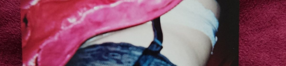
I also created numerous different sizes of clay, abstract vaginas – especially smaller ones, and I hope to include issues such as the ‘designer vagina’ that means to “tidy” vaginas by trimming the labia. I want to make them look floral from certain angles, which would aesthetically deem them beautiful, such as what I’ve done below;

img_20180217_231918_824292849745.jpg

I began by making miniature clay pieces of vaginas from drawings I made in my sketchbook. I made 23 in total and they’re all in various shapes and sizes and have an organic look to them to fit in with the illusion idea I have to take pictures from different angles and have them look floral. Here are how they look before being painted;

And below are after being painted. I then began experimenting with different camera angles to get the best effect for my idea. Some came out terribly while others really worked!

I stuck with using a bright pink/red colour for the vaginas to resemble bright red flowers, and I’m really happy with how they turned out. It was difficult to get my phone camera to focus on the pieces very closely, therefore I wasn’t able to take zoomed in pictures and create an even better illusion to get people to question what they are, but I do feel that they look organic enough for this effect anyhow.

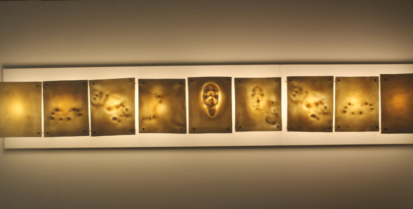
I was also able to finished shaped/relief paintings I began a while ago, which were, once more, based off of drawings in my sketchbook. I first off used clay to add depth to the shapes I’d cut out, then painted and used fabric on one to correspond with my previous work about fetishism with, for example, hair, clothes, bows, etc. They tie-in my previous shaped paintings with my clay sculptures well by being a transition between the two and they also helped me with my dissertation research by letting me look further into these topics.

G39

In G39 this afternoon, I was able to see pieces by artists such as Anna Grace Rogers, Gweni Llwyd, Mark Hicken, Heledd Evans, AJ Stockwell, Thomas Williams, Elin Meredydd, and many more.

They made collaborative work based off of their time in Venice;
“There is a difference between visiting a place and living in a place. When visiting a place, everything becomes exotic, its otherness is made more tangible by our fleeting experience of it. For a short amount of time our rituals and habits and ways of being that tick-tock our everyday lives are replaced. In this new place we sleep at different times, we eat different food, we look at the world differently. Venice is an oasis, a mirage, a shimmering watery floating/ not floating place of looking seeing smelling and experiencing life differently. It is all there for our consumption – for a short amount of time before we turn and leave it.

But being there for a job, for an extended period of time, its customs become ours. We experience Venice in new ways. We are neither natives or tourists anymore and our passage through the city is irritated by the slow-gazing, bridge-stopping drift of sightseers that we were once a part of. We need the launderette, to get to work, and to move more efficiently. We wake up there. ”

In May 2017 the Wales in Venice exhibition, James Richards: Music for the gift curated by Hannah Firth was launched. g39 has been working with the group of artists, writers and curators who were invigilators at the venue in Venice for the length of the show. They have been immersed in the show, keeping everything going, speaking to visitors, and locals, responding to the culture, language, history, the city of Venice, James’ show and the other Biennale exhibitions.

They have also been spending time in Venice developing new work and research and we have invited them to present it at g39. The works here will interact with each other; rather than stand on their own, the collection of individual objects becomes one overarching experience.

It has been curated as a varied collection of artworks, artefacts, objects, sounds and actions and research, where each occupies the same space. Reflecting on an eclectic and domestic curatorial approach they’ve created a model of the artists shared domestic space as a framework to combine and assemble the work. This is a replica of the space where the invigilators lived, on the strange isle of Certosa in the Venetian lagoon.

Certosa is an Italian word meaning monastery, or charter house. The Isle of Certosa has little of the grand historic architecture associated with Venice and, apart from a hotel (and marina), there is nothing there for tourists or sightseers. The isle has its own strangeness, isolation and peculiar character that feel neither contemporary nor steeped in history.

Every two years Venice is the host to the Wales pavilion at the Biennale, a part of life here is transplanted there for the duration of the Biennale, still one of the cultural markers of the year for curators, dealers and artists. What is often overlooked is that Wales is also growing a relationship with a space, with a community there and with Venice itself. After the first wave of Biennale guests leave, the people local to the venue come to see the work, come to see the buildings that are theirs and continue an ongoing dialogue with Wales through the live-guides.

Final Exhibition Personal Statement

After visiting Venice back in October, I decided to work with the drawing I saw by Huguette Caland titled Self Portrait (1971). I began by drawing it in my sketchbook, then started to alter it until I was making many organic-looking vagina drawings. At the same time, I began making shaped paintings of the drawings, but none were showing my ideas the way I wanted them to. Therefore I decided to carry on drawing, reading and researching into feminism and vaginas until I knew exactly what I wanted to do with these drawings. I then decided to use clay a lot more, since it enabled me to make organic-looking pieces by being delicate like leaves and petals, but with the texture of a vagina. I made a large shaped painting based off of the idea of the ‘designer vagina’ where women get cosmetic surgery to remove ‘excess’ labia. I painted it a red-pink colour, then by accident, I took a picture of it at an angle that made it look like a rose. Because of this, I began making many clay vaginas that resemble flowers or other plants from my drawings and took pictures of them from angles that emphasised their organic look. This is mostly to add humour to a fairly serious topic of how women face pressure of having a good looking vagina, when they come in all shapes, thus comparing  them to something as natural as flowers that are all unique, and in a way that is only seen from certain angles, offers my opinion on the matter. Comparing vaginas to flowers is also historically a very famous metaphor, and often a sexist one. For example, we often hear about men ‘de-flowering’ women (taking their virginity), which certainly has negative connotations, implying a change and impurity to the women who’ve been sexually active.

I’ve also touched on this work in my Site Venue project, by taking photographs of myself modelling a vagina piece I’ve made as a performance Red Light District worker. I’m very interested in how the women are treated there and the constant laws that are changing to ensure their safety and respect, such as not letting tourists look and bother them for amusement. I was also keen on how an audience of people, such as my instagram following, would react if I released a series of similar scenes of the District. I also photoshopped a ‘peeking Tom’ through my window to make the series of photos blatantly humerous art pieces, making the negative reactions I received even more interesting. I’ll be looking into making more work like this in the future, as I really like the idea of developing my work by using them as ‘props’ in photographs, almost making the pictures a part of a performance piece. Using myself as the object came from looking into Cindy Sherman’s work at the beginning of the year, especially at her Untitled series, where she explores the male gaze, a concept theorised by Laura Mulvey in 1975. Sherman’s utilisation of the male gaze is complex: in one sense she diverts her passivity by being both the looker and the looked at, but in another way she consistently re-establishes the gaze by playing the victim or sexualised object. The “Untitled Film Still #6” (below), taken in 1977, Sherman exposes herself in her underwear, holding a mirror in one hand as she dons her usual emotionless expression. While the image is clearly sexualised, Sherman also demonstrates how femininity is a disguise, a performance, and then so too becomes the commander of the gaze. I want to almost recreate this idea by using myself as a sexual object, as I’ll certainly be in the cubicle for the male gaze, but I’ll also be fully in control of what is seen and my safety, something I believe sex workers lack the right of in the UK.

Evaluation of my Field experience

I believe that both field projects have been hugely successful and I really enjoyed the entire process. My work has always revolved around politics and are never abstract, which can be quite restrictive after a while if I want to go outside my comfort zone because I find it difficult to know how to do that. Things Behind The Sun let me do this easily by letting me look at landscapes and draw extremely quickly in challenging weather, forcing me to draw what I saw, which enabled me to see my drawing style and came out with 5 drawing motifs to work with in the print studio. Being able to see these abstract new styles led me to look at artists that I had never considered before, including Vija Celmins and Eduardo Chillida. Vija Celmins uses monochrome and simple objects in her work, like the sea, but they can offer incredibly deep meanings that are open to interpretation, such as man-mad waste within the sea. This let me think more about how I could create work that doesn’t have to be obviously at politics, but more about letting people look at it for longer to offer a meaning themselves. This would in turn perhaps make my work even more political. Chillida uses simple, geometric shapes, which is something that came out of my motifs and helped me create more abstract pieces. I’ll definitely be using these techniques in the future throughout all of my modules, especially in subject and field.

In the Relational Colour module, we successfully completed a ‘Bryan Wynter’ box, which became hugely useful for my final subject piece, and over twenty different slides together, as well as a variety of different hanging pieces. I was initially unsure about working very precisely and having to measure and plan things out because I’m never inclined to do so with my own work. However, I found that I did enjoy the process and that the finishing outcome of what we made looked very professional. I started my thought process to get ideas by looking at artists, mostly Howard Hodgkin and his work “After Visiting David Hockney” (First Version), 1991, because his work is totally expressionistic and relational. I was really interested in how he created depth in his work, while only using flat surfaces, therefore I decided to play on this idea during this project. I also wanted to use colour in an interesting way, therefore I also researched into Frank Stella, and his piece ‘Hyena Stomp’, 1962. He’s used contrasting colours that aren’t completely aligned, further contrasting using the lines and pattern, something I enjoyed experimenting with during this project.

This project also unexpectedly made me realise what I really enjoyed about working with colour and shapes, which was the optical illusion aspect of it. I further researched into artists who made work around this, such as Oleg Shupliak, whom I’ve never come across before, although could really help me in my subject work, as I like working around metaphors and political issues. Using illusions could definitely help me convey my ideas interestingly, and help it be not quite as obvious as I had previously been working. I printed on fabric and made prints to convey all of these ideas in a workshop, and I decided to make as much work possible to be able to have a huge variety of pieces to use for the slides in the box.

I believe that I’ve never had such a successful outcome while working as a group, and I’ve initially always tried my best working independently because of previous failures. However, working with this group has made me want to carry on working with others, and perhaps even work collaboratively in my subject area with people who work similarly and differently to me, as group work seems a lot less challenging after this project.

Overall, I had an amazing time during these projects and I learned a lot of new skills, for example, the fabric printing and lazer cutting, as well as develop old ones that will be very useful to my future work, such as working collaboratively to create exciting pieces of work.


Technical skills I have learnt and developed from Relational Colour

We successfully completed a ‘Bryan Wynter’ box and over twenty different slides together, as well as a variety of different hanging pieces. I was initially unsure about working very precisely and having to measure and plan things out because I’m never inclined to do so with my own work. However, I found that I did enjoy the process and that the finishing outcome of what we made looked very professional.

This project also unexpectedly made me realise what I really enjoyed about working with colour and shapes, which was the optical illusion aspect of it. I further researched into artists who made work around this, such as Oleg Shupliak, whom I’ve never come across before, although could really help me in my subject work, as I like working around metaphors and political issues. Using illusions could definitely help me convey my ideas interestingly, and help it be not quite as obvious as I had previously been working. I printed on fabric and made prints to convey all of these ideas in a workshop, and I decided to make as much work possible to be able to have a huge variety of pieces to use for the slides in the box.

I will definitely carry on with working with colour and bring many ideas that I’ve gathered from this project to my own work. The use of colour was never important to me before this project, therefore being able to use it primarily to create the overall effect has really opened my eyes to using it carefully. This will further add to using a more abstract approach to my future work, such as the optical illusion aspect that I really enjoyed.

The most important thing I’ve taken from this project is to not be afraid to build things and be practically creative. Making this box partly inspired my final piece by pushing me to build a large cubicle-type MDF box for my red light district inspired performance. Making the box for this project made it a lot easier to plan and build, and knowing what I knew after let me plan it from scratch, thus giving me the freedom and opportunity to do exactly what I wanted for the exhibition.