Relational Colour – 08/02/18

We based today on choosing the slides, making them and planning what would look best with what. This was really helpful for us because it helped us figure out what we had left to do and how much time we needed to do everything. I experimented with a print I made yesterday and cut out the shapes, making it transparent enough to be able to see prints behind it;

Here’s a video of one of our compositions using four prints;

How the lines join from some angles and how they disappear in some others really intrigue me because how the piece is perceive is entirely down to where you’re standing, making it almost an optical illusion in ways. It also makes this interactive art, as it makes the spectator have to move around with it to see all its shapes and illusions. This work resembles Victor Vasarely’s work with the use of lines an colour, which is an artist I’ve already been looking at, making me think that we were subconsciously thinking of these artists while making the work.

This has had me thinking abut my own work in subject, and how I could incorporate these ideas and artists into my political pieces. I’m already working with fabric, but I’ve never made them myself, which could be a great starting point. I could also look into optical illusions by using more metaphorical and abstract pieces to convey my ideas, like how Oleg Shupliak uses his paintings to capture illusions. I could use this in my sculptural pieces by using two different ideas that all link to my political points.

Image result for Oleg Shupliak

Relational Colour – 07/02/18

The frames have now been painted blue to match the interior of our box, and I also had time o create new prints, by printing my other pattern onto coloured backgrounds and a few of my previous prints;

The two patterns are totally different to each other but really worked together, as if they were made together originally. We wanted to use some red to be able to contrast with the blue interior and frames, as well as match the outside of the box, which worked really well when we took our box into a dark space and started experimenting with some lights, including coloured ones. This is the link to the video of experimenting with light in natural lighting; https://youtu.be/zITy6yko47w ; And this is to the video in a dark room; https://youtu.be/zf4h3KtfaU0 .

I also took images of the shadows that were created with a few of the slides;

These were really beautiful to look at, but it also distracts away from the colour contrasts and the shapes form the prints, which makes it debatable whether we want to keep them or not, however they were still interesting to play with.


Relational Colour – 06/02/18

We’ve made huge progress in collaborating our work and ideas, and have even started on the slides and thinking about the compositions. I also had time to make a print of my own, which is below;

I chose the three colours orange, black and green because I wanted to see what would happen if I separated two contrasting colours by adding such a statement, block colour in the middle. I think the effect is really interesting, especially as I made a few of them and the colours began mixing into each other, making the contrasting colours come even closer together. I also like how the contrasting patterns look next to each other, because I’ve given the print some ‘order’ by splitting them up with straight lines that makes the print make more sense by helping it look finished.

We were looking at how to organise the slides, because a lot of our work’s not translucent, therefore we needed to work out how to be able to use them and also see through to the other slides. We figured out that we could use some clingfilm and stick some of our work onto that, and also by cutting out shapes and halving prints, creating almost 3D and ‘floating’ compositions.


We still have about half of the slides to make, and we’re also planning on painting the frames blue to blend in entirely with the inside of the box. There has also been some experimentation with cutting out shapes and having them hang onto other prints, or from the plastic lid, creating movement and shadows. We’re also going to experiment with coloured lights and move them around with different compositions to find the ten most complimentary and interesting collaborations of work.


Relational Colour – sketchbook work

Here are a few pictures from my sketchbook that I’ve been keeping for this project, containing lots of different ideas, plans, artists, and colours, which have all inspired my work and influenced my working process, since I don’t regularly plan my work but has definitely helped during this project. Being able to draw out my ideas also made it a lot easier to explain and communicate with my group.


Relational Colour – 1/02/18

T 
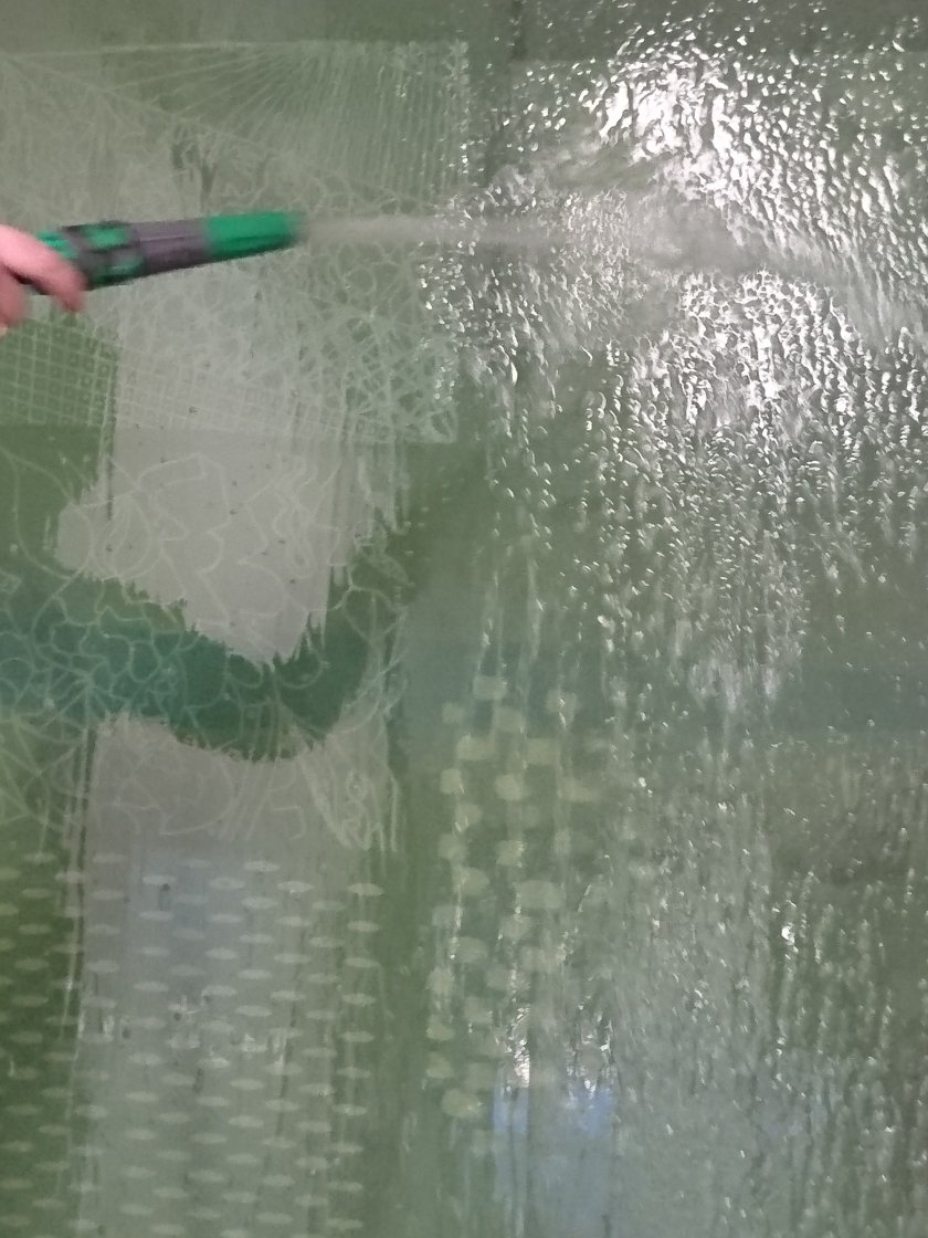
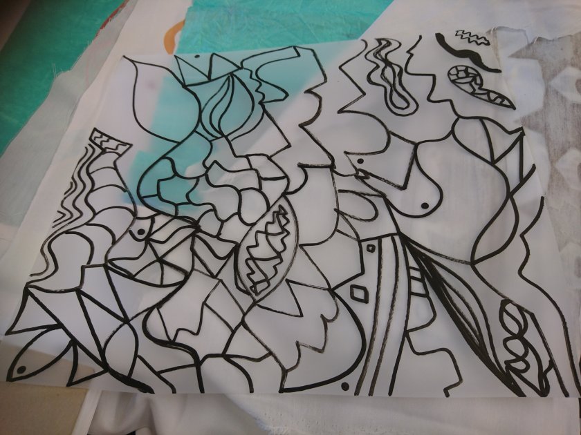
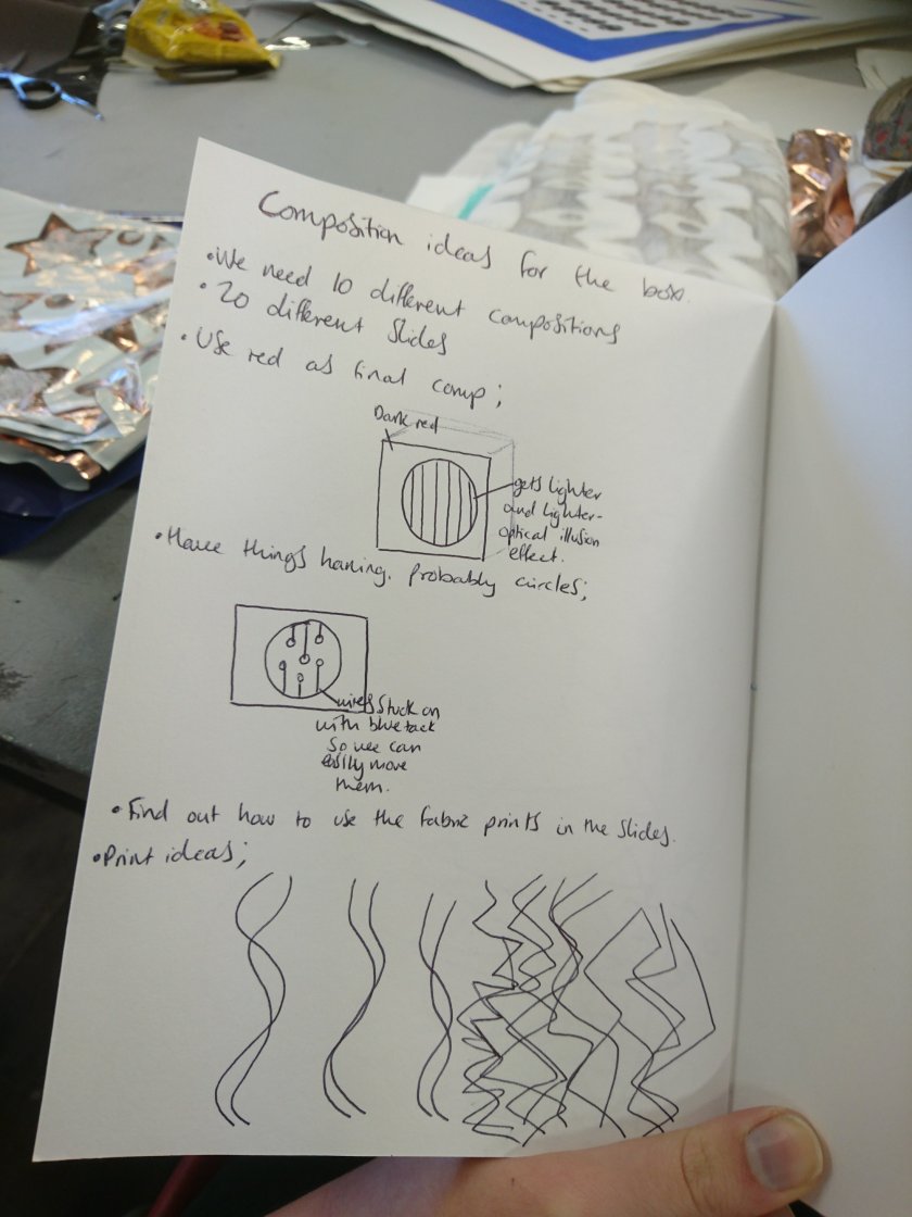
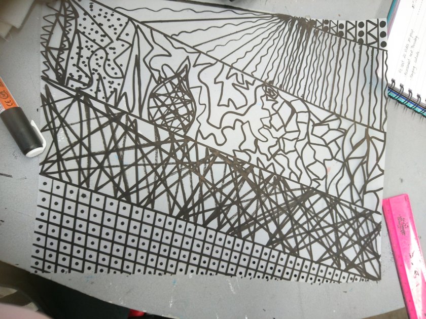
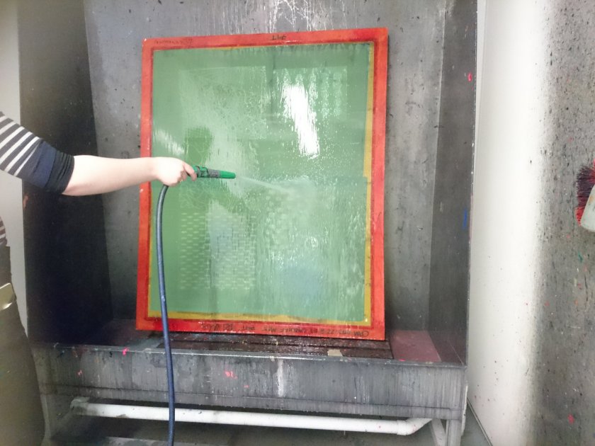
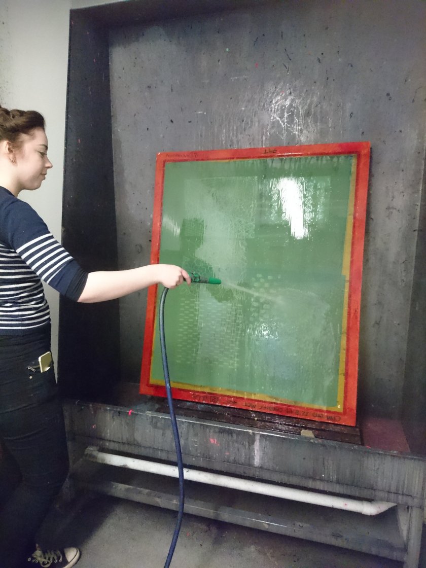
oday, I was able to participate in the print room with the rest of my group, and we shared ideas on how to execute the box, including the 10 different compositions using 20 different slides, and perhaps a “finished composition”. I decided to make a few designs to print on paper, in order to have a good variety of pieces to play about with and compare different compositions. I also wanted to keep with a mixture of solid geometric shapes, as well as more expressionistic patterns so that they’d already be contrasting.