Grayson Perry

I recently visited the Grayson Perry exhibition in Bristol Museum & Art Gallery, exploring Britain’s fascination with taste and how different social classes differ taste. Perry’s work is inspired by Hogarth’s morality tale, A Rake’s Progress. His tapestries follow the socially-mobile life of fictional character Tim Rakewell from infancy to untimely death. These tapestries were made alongside the documentary, All in the Best Possible Taste, which was also shown at the gallery. They are crammed with acutely-observed detail and invite us all to consider our own attitudes to class and our positions in society.

Image result for grayson perry bristol exhibition

Image result for grayson perry bristol exhibition

The exhibition also includes a number of other works, including historical ceramics, and the original Rake’s Progress print series by William Hogarth and David Hockney. I was especially interested in the link to David Hockney’s work and his involvement in the queer scene, as I already look into minority groups. His work was incredibly interesting to view because of the era these works were made, as some might describe the turning point of the lgbt+ community. Hockney wanted to celebrate just how different the gay lifestyle is from the heterosexual one. It has to do with extravagance, treating the world as a playing field for daredevils, and, most of all, leading an unapologetic life.

Image result for david hockney queer art bristol

David Hockney: the arrival, etching from the Rake’s progress series, 1961-3.

Oxford Trip – 21/03/18

At the Modern Art Oxford we saw the new commissioned site-specific instillation from Brazilian artist Cinthia Marcelle, The Family in Disorder (2018). It is accompanied by the premiere of Truth or Dare (2018), a video animation of photographs taken by the artist during a recent residency in South Africa. Together, these works provide an introduction to one of Brazil’s most significant contemporary artists.

This new commission is realised in the wake of rising social inequality caused by multiple political and economic crises, both in Marcelle’s home country of Brazil and across global society. Considering the exhibition as a space of occupation, the work provokes a dialogue about citizens’ rights and access to public space, drawing parallels between various social and educational structures in Oxford and Brazil.

Image result for cinthia marcelle modern art oxford

Here are other images I found interesting from the Ashmolean Museum and Pitt Rivers Museum – I especially enjoyed the dinosaurs, witchcraft/voodoo and shrunken heads;


Ways of Exhibiting – how artists display and disseminate their work

We, as a class, looked at different ways of exhibiting work and how to build art from the space you’re working with, be it large or small. We looked at artists, from our own students at Cardiff School of Art and Design like Melissa Mavroudis Stephens (L4) to those who decided to go beyond the planet, such as Forrest Myers in his ceramic chip piece to the moon, titled ‘Moon Museum’, 1969.

Image result for forrest myers moon museum

We all had a box each and planned out ideas on how to use them to exhibit our work, and then use them later on during this project for our locker exhibition. My immediate idea was to create a room in the red light district, since I visited last winter and have quite a few opinions on them. I really like the idea that the sex workers are genuinely cared for and have laws to protect them, and I also like how they make money from ‘playing’ the objectifying game, that’s usually against women, to make a living. I’ve started quite a few sketches and I’ve already painted the outside of my box black, and the inside red. I want the inside to look as comfortable as I can – almost like a home – to emphasise how much safer women are when sex work is legalised.

I started by making plans in my sketchbook of what I was planning on making for my “red room”, including curtains, a bed, photographs, etc. I also planned on using luxurious fabrics to add to the sexual feel of the room, including black lace and red velvet.

I started the box by making sure it was sturdy by taping all of the fragile areas, then proceeded to paint the outside black and the inside red with acrylic paint.

I began by making my framed photographs of various humorous images I found online, including a women with very large breasts, a man with “moobs”, a rat positioned as a phallus and an “I Love Penis” sign. I also decided on making the curtains out of lace, which plays with fetish, eroticism and teasing.

dsc_0031452322452.jpg

I hung all of the photographs on the back wall to enable them to be visible for all viewers, then created a bed out of cardboard and red velvet fabric, with red velvet and black lace pillows. I was also playing with where the mystery woman was going to stand, positioning her in various areas of the room and debating on giving her features of painting her entirely black, creating an ambiguous character.

I finally decided on painting her black, almost letting the viewer become her if they wished to, making her character relatable and fit well with how sex workers are dehumanised in countries that make them criminals. Below are images of the final display I made;

I tried taking pictures using a red light, which worked by making the inside look eerie and mysterious, but it didn’t show much of the room, leaving me undecided about how I want to exhibit the piece. I might invest in some red neon lights and take pictures with them inside, which should give a really intense look to the images.

We were also presented Dioramas which currently denotes a partially three-dimensional, full-size replica or scale model of a landscape typically showing historical events, nature scenes or cityscapes, for purposes of education or entertainment.

We looked into artists who all interpreted dioramas in their own unique ways, such as Louis-Jacques-Mandé Daguerre, Jean-Paul Favand, Jake and Dinos Chapman, Serena Korda, Marvin Gaye Chetwynd, Janet Cardiff and George Bures Miller, etc.

Image result for Janet Cardiff and George Bures Miller 2004

Janet Cardiff and George Bures Miller’s Diorama, 2004

Image result for blue peter thunderbirds tracy island

Blue Peter Thunderbirds Tracy Island, 1993.

We practiced the skill of Dioramas by making one with the first thing that popped into our minds. I decided to make one of a ski slope, probably because the winter olympics had only just happened and we just experienced the ‘Beast from the East”, causing huge disruption and blizzards, causing some to bring out their skiing equipment onto the streets.

I completed my Diorama by using a box (with a French food brand on the side, fittingly), and cut one end off in a diagonal line, leaving me with one open end. I then needed to create my ski slope, and decided to do so by scrunching up large pieces of paper, sticking them together and onto the closed side of the box. I made this side higher, and continuously used less and less paper as I went down to the open side of the box, giving me a base for the slope. I then used the pieces of cardboard I cut off previously and used them to put on top of the scrunched paper, giving me a smooth and flat surface, the stuck them on with tape. Using the paper mache technique, that I’ve never had the pleasure of doing before, I started to top the cardboard slope with toilet paper and PVA glue mixed with water and started to build it up. Using clumps of toilet paper, I made deeper “snow” on the sides and glazed PVA over to make it look shiny. The people I used were from the Winter Olympics, and I printed them out then cut them onto pieces of cardboard to enable them to stand up, completing the wintry scene. This was a very interesting exercise, as I’d never done paper mache before, and it proved that artist can still use “silly” or child-like techniques in their work and still end up with an exciting piece.

Relational Colour research and its influence to my studio practice

As a group, we successfully completed a ‘Bryan Wynter’ box and over twenty different slides together, as well as a variety of different hanging pieces. I started my thought process to get ideas by looking at artists, mostly Howard Hodgkin and his work “After Visiting David Hockney” (First Version), 1991, because his work is totally expressionistic and relational. I was really interested in how he created depth in his work, while only using flat surfaces, therefore I decided to play on this idea during this project. I also wanted to use colour in an interesting way, therefore I also researched into Frank Stella, and his piece ‘Hyena Stomp’, 1962. He’s used contrasting colours that aren’t completely aligned, further contrasting using the lines and pattern, something I enjoyed experimenting with during this project.

I hope to create a combination of these styles through my work, by thinking a lot more carefully about the colours I’m using and why I’m using them, as well as make them more abstract and expressionistic. This lead to me wanting to look further into optical illusions, therefore I further researched into artists who made work around this, such as Oleg Shupliak, whom I’ve never come across before, although could really help me in my subject work, as I like working around metaphors and illusions can really help with this.

Image result for Oleg Shuplyak

Assessment Personal Statement

After visiting Venice back in October, I decided to work with the drawing I saw by Huguette Caland titled Self Portrait (1971). I began by drawing it in my sketchbook, then started to alter it until I was making many organic-looking vagina drawings. At the same time, I began making shaped paintings of the drawings, but none were showing my ideas the way I wanted them to. Therefore I decided to carry on drawing, reading and researching into feminism and vaginas until I knew exactly what I wanted to do with these drawings. I then decided to use clay a lot more, since it enabled me to make organic-looking pieces by being delicate like leaves and petals, but with the texture of a vagina. I then made a large shaped painting based off of the idea of the ‘designer vagina’ where women get cosmetic surgery to remove ‘excess’ labia. I painted it a redish-pink, then by accident, I took a picture of it at an angle that made it look like a rose. Because of this, I began making many clay vaginas that resemble flowers or other plants from my drawings and took pictures of them from angles that emphasised their organic look. This is mostly to add humour to a fairly serious topic of how women face pressure of having a good looking vagina, when they come in all shapes, thus comparing  them to something as natural as flowers that are all unique, and in a way that is only seen from certain angles, offers my opinion on the matter. Comparing vaginas to flowers is also historically a very famous metaphor, and often a sexist one. For example, we often hear about men ‘de-flowering’ women (taking their virginity), which certainly has negative connotations, implying a change and impurity to the women who’ve been sexually active.

I’ve also touched on this work in my Site Venue project, by taking photographs of myself modelling a vagina piece I’ve made as a Red Light District worker. I’m very interested in how the women are treated there and the constant laws that are changing to ensure their safety and respect, such as not letting tourists look and bother them for amusement. I was also keen on how an audience of people, such as my instagram following, would react if I released a series of similar scenes of the District. I also photoshopped a ‘peeking Tom’ through my window to make the series of photos blatantly humerous art pieces, making the negative reactions I received even more interesting. I’ll be looking into making more work like this in the future, as I really like the idea of developing my work by using them as ‘props’ in photographs, almost making the pictures a part of a performance piece.

The Everyday by James Green – 12/03/18

In today’s key concept’s lecture by James Green, we were introduced to a series of different comical pieces that has greatly influenced his work. I was really intrigued by these pieces by William Hogarth of Beer Street and Gin Lane, 1751, which are currently shown at the British museum.

Image result

A scene of urban desolation with gin-crazed Londoners, notably a woman who lets her child fall to its death and an emaciated ballad-seller; in the background is the tower of St George’s Bloomsbury; in this state, the child’s face has been changed so that the face is wizened and the eyes sunken. Charles Dickens captured scenes like these marvelously in his novels, portraying what the living conditions were like in large cities like London at the time. He walked for miles and miles a day to get inspiration like this, making his description of the era very accurate.

A flourishing urban scene with well fed citizens; in the foreground, butchers, fish wives and a City of London porter hold large tankards of beer; a butcher lifts a skinny Frenchman into the air with one hand; in the background, paviours repair the street

In contrast, this is a flourishing urban scene with well fed citizens; in the foreground, butchers, fish wives and a City of London porter hold large tankards of beer; a butcher lifts a skinny Frenchman into the air with one hand; in the background, paviours repair the street, chairmen carry a stout lady, tailors sew in a well lit attic, builders work on the roof of a house clad with scaffolding, and a warehouseman hauls a barrel to an upper storey – all are drinking beer; poverty appears only in the ragged coat of the artist painting the tavern sign and, more particularly, in the collapsing house of “N Pinch Pawn Broker”. This contrast in the lives of the people amplifies how horrendous this extremely capitalist society was really like.

Here are a few other pieces that really captured my imagination;

James Gillray, Punch Cures The Gout, 1799, Hand coloured etching, National Portrait Pallery. This is comically ironic because “punch” makes gout a lot worse.

'Punch cures the gout, - the colic, - and the 'tisick', by James Gillray, published by  Hannah Humphrey, published 13 July 1799 - NPG D12701 - © National Portrait Gallery, London

– Doublûres of characters, 1798.

'Doublûres of characters; - or - striking resemblances in phisiognomy', by James Gillray, published by  John Wright, published 1 November 1798 - NPG D12663 - © National Portrait Gallery, London

Pl. to ‘Anti-Jacobin Review’, where it has no relation to the text, and is placed at random. Also issued separately. Bust portraits of seven leaders of the Opposition, each with his almost identical double, arranged in two rows, with numbers referring to notes below the title. The first pair are Fox, directed slightly to the left, and Satan, a snake round his neck, his agonized scowl a slight exaggeration of Fox’s expression; behind them are flames. They are ‘. The Patron of Liberty, Doublûre, the Arch-Fiend’. Next is Sheridan, with bloated face, and staring intently with an expression of sly greed; his double clasps a money-bag: ‘. A Friend to his Country, Doubr Judas selling his Master’. The Duke of Norfolk, looking to the right, scarcely caricatured, but older than in contemporary prints. His double, older still, crowned with vines, holds a brimming glass to his lips, which drip with wine. Character of High Birth, Doubr Silenus debauching’. (Below) Tierney, directed to the right, but looking sideways to the left: ‘IV. A Finish’d Patriot, Doubr The lowest Spirit of Hell.’ Burdett, in profile to the right, with his characteristic shock of forward-falling hair, trace of whisker, and high neck-cloth, has a raffish-looking double with similar but unkempt hair: ‘. Arbiter Elegantiarum, Doubr Sixteen-string Jack’ [a noted highwayman]. Lord Derby, caricatured, in profil perdu, very like his simian double, who wears a bonnet-rouge terminating in the bell of a fool’s cap: ‘. Strong Sense, Doubr A Baboon.’ The Duke of Bedford, not caricatured, and wearing a top-hat, has a double wearing a jockey cap and striped coat (see BMSat 9380): ‘. A Pillar of the State, Doubr A Newmarket Jockey’. After the title: ‘”If you would know Mens Hearts, look in their Faces” Lavater.’ 1 November 1798
Hand-coloured etching and stipple.
Spitting image, 1984-1966 – a series that mocked politicians, celebrities and the royal family through the use of comical puppets of them. A lot of the sketches are still hilarious to watch, even though the stories were based off of current events of the time.

https://www.youtube.com/watch?v=jINZBOxdja8

Garbage Pail Kids, 1987 – politicians, parents and teachers got involved wanting to sue the company because they were “gross”, making children to want to collect them desperately.

Image result for Garbage Pail Kids, 1987 - politicians get involved wanting to sue

Fletcher hanks, 1887-1976. Fantomah: Mystery Woman of the Jungle, by Barclay Flagg aka Fletcher Hanks, who was the first ever female superhero.

Fantomah

David Hockney used impact lines to add speed to a picture or to focus something in the picture and create and almost 3D effect, which is commonly used in comics. We see this in his piece ‘A Walk Around The Hotel Courtyard, acatlan, 1985;

f8f11dc8cc92a78fe534def58d7ec82c.jpg

James then brought us the pleasure of showing us his comics that he’s made throughout the years, which I unfortunately don’t have the specific image of, but I loved the use of green and blue to portray somewhere grubby and unpleasant, which was what Vincent Van Gogh did in The Night Cafe, 1888.

Image result for the night cafe van gogh

(References to M F Green, Super String Comics, 2012)

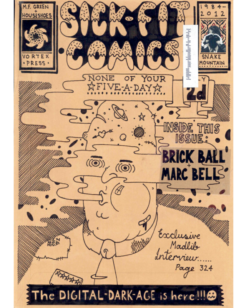
Here’s an example of one of his comics;

Beauty – 26/02/18

We were introduced the different types of beauty within art, including the superficial. Kitsch, and prettiness, which all fit into the “meaningless” category. For example, Jeff Koons’ ‘Large Vase of Flowers’, 1991, bronze (below); we see this painting as beauty as a culture and society, thus making this in particular clever, since he expects the audience to be attracted to its beauty, and is an example of Kitsch beauty. They don’t have any deeper meaning; they exist to please the eye and attract.

Image result for jeff koons large vase of flowers 1991

We then looked into another side of beauty, which are used as an alibi for a hidden meaning. These include seduction, deception, and a cover for political manipulation. Ai Weiwei’s ‘Straight’, 2008-12 (below) is an example of this, as it’s a beautiful piece to look at, but is about the earthquake that hit China and acts as a memorial for all the children who died. All the pieces of concrete were found from the wrecks of the earthquake and hand straightened back to how they originally looked, making them look like they’d been produced by a machine. They’re also meant to look like the tectonic plates that caused the earthquake, as the design seems as if it’s moving away from each other. We, as an audience, would only realise this after the piece seduces us to look at it for longer; if it didn’t contain beauty, we’d easily dismiss it. This could be argued as being worse than meaningless beauty, as we consume the real meaning without realising it, making it a powerful tool, especially in politics. An example of this is Igor Babilov’s portrait of George W. Bush, 2002, which makes him look kind and intelligent, which is totally the opposite of most people’s opinions of the former president.

Image result for ai weiwei straight


re.act.feminism

re.act.feminism #2 is an international, multi-annual performance and exhibition project traveling through Europe since 2011 and I decided to look into it after going to an art performance lesson by Davida, with the aim of incorporating some into my own artwork. The core archive contains more than 250 videos, photographs and other documentation of gender-oriented, feminist and queer performance art, from the 1960s to the early 1980s.

The core of the project was a mobile archive and workstation with a growing collection of videos, photographs and other documents of feminist, gendercritical and queer performance art. It was a transnational and crossgenerational project featuring works by artists and artist collectives from the 1960s to the beginning of the 1980s, as well as contemporary positions from Eastern and Western Europe, the Mediterranean and Middle East, the US and in Latin America. On its journey through Europe –starting in Spain and continuing through Poland, Croatia, Denmark, Estonia and ending in Germany- this temporary archive continued to expand through local research and cooperation with art institutions, academies and universities. It was also ‘activated’ through exhibitions, screenings, performances and discussions along the way.

Narcissister, Untitled (cigarette blonde) 2012, c-print, 40 x 30 inches, edition of 2, 1AP, Courtesy of the artist and envoy enterprises. 21 June 2013 – 18 August 2013, Akademie der Künste. Berlin, Germany.

I’m really interested in the type of art exhibited at this event, especially since I can link many to my own work and ideas. I want to take photographs of myself, using my art as props somehow, thus bringing women’s issues up, most probably humorously by using myself as the object.


Davida’s ‘Failiure’ Lecture – 19/02/18

The lecture Davida brought us was about Failure Art; an art that can’t be made to fail, as that would defeat its purpose. This thus became popular in minority groups, such as the LGBT+ community, as they’re already failing society’s pressures of gender and sexuality. I found this extremely interesting, as I already deal with politics in my art, and found these artists Davida showed us intriguing, especially Vanessa Beecroft;

Vanessa Beecroft, vb45.9043.ali, 2001, performance at the Kunsthallie Wien, Vienna, image courtesy of Vanessa Beecroft.Image result for vanessa beecroft

The artist’s work is a fusion of conceptual issues and aesthetic concerns, focusing on large-scale performance art, usually involving live female models (often nude). At her performances, video recordings and photographs are made, to be exhibited as documentation of the performances, but also as separate works of art. I find this interesting because the women often start off as sort of mannequins and must stand ‘exhibiting’ for hours, and when they begin to get tired, they start sitting down which is a sort of ‘failure’, and proves our mortality and could also be seen as a feminist piece, as women aren’t made to be these perfect doll-like figures.

The work and her conceptual approach is neither performance nor documentary, but something in between, and closer to Renaissance painting. She sets up a structure for the participants in her live events to create their own ephemeral composition. The performances are existential encounters between models and audience, their shame and their expectations. Each performance is made for a specific location and often references the political, historical, or social associations of the place where it is held. Beecroft’s work is deceptively simple in its execution, provoking questions around identity politics and voyeurism in the complex relationship between viewer, model and context.

Beecroft’s performances have been described as art, fashion, brilliant, terrible, evocative, provocative, disturbing, sexist, and empowering. The primary material in her work is the live female figure, which remains ephemeral, and separate. These women, mainly unclothed, similar, unified through details like hair colour, or identical shoes, stand motionless, unapproachable and regimented in the space while viewers watch them. Neither performance nor documentary, Beecroft’s live events are recorded through photography and film, but her conceptual approach is actually closer to painting: she makes contemporary versions of the complex figurative compositions that have challenged painters from the Renaissance onwards. Beecroft’s more recent work has a slightly more theatrical approach; the uniforms are period clothing, not nudity, and some of her performances include food, while others have featured men in military attire.

(information from http://www.itsliquid.com/featured-artist-vanessa-beecroft.html)

Another artist I found interesting was Bas Jan Ader, and his piece Fall III, 1970. This image interested me so much, that I researched further into him and found that I really enjoyed his melancholy and mysterious films he makes.

Image result for bas jan ader fall iii 1970

Still image from  Fall 1. Ader sitting on a chair on a slanting rooftop

Ader falls from the chair of top of the roof and is rolling downwards.


Still image from Fall 1. Photograph: Courtesy of Simon Lee Gallery

‘Chasm’

Ader hitting the edge of the roof.

Ader’s work rebuffed the idea that art was there to communicate. Here we see Ader’s fall represented on film, yet we can never understand how it actually felt.

‘Melancholy’

Ader free falling

Ader knew he was entering the slapstick world of Keaton or Chaplin here; like those comics, the abiding feeling raised by his film is melancholy.

‘Tragedy’

Ader stand up upon hotting the ground.

Shown alongside four other “falling” films, it’s hard not to view these as premonitions of Ader’s tragic death: in 1975 he disappeared while sailing across the Atlantic, almost making himself his last ‘failure’ art piece.

(Information from https://www.theguardian.com/artanddesign/2016/jun/24/anatomy-of-an-artwork-bas-jan-aders-fall-1-los-angeles-1970)

Function of Studios – Davida’s home

I learnt from this trip to Davida’s home that your studio space could be anywhere; a huge, expensive apartment to a spare room in your home. It all depends on what you’ll be needing it for, what type of work you specialise in as well as affordability. A painter might need a lot of space, when perhaps someone who specialises in films might need to temporarily rent out many different locations. This is a lot to think about when it comes to my own work, as I like to jump into many different things all the time. The space I have at home is perfect for editing films or photography, but I love using my university studio space for larger pieces such as my shaped paintings and clay work, making me think that I might need a large place to create work in the future.

Davida balanced work, being a single mother and her art in one household, proving a great possibility for my future creative space. I’d like a separate place to be able to do my work in, but perhaps it isn’t realistic considering realistic financial situations. But seeing Davida’s work space has eased my mind about this, as she lives near Chapter, where she can work in as well as her home space, proving that there are ways around everything.